How to Add a Target Line in an Excel Graph
In this tutorial, we’ll have a look at how to add a target line in an Excel graph, which will help you make the target value clearly visible within the chart.
Ready to start?
Would you rather watch this tutorial? Click the play button below!
How to Define a Target Value in a Graph
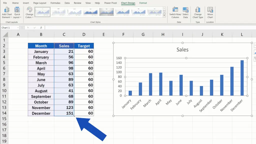
If you need to show a target value in a graph, the first step is to define it. Let’s insert another column next to the column Sales and name it Target. We also adjust the formatting of the table to make it consistent and move on.
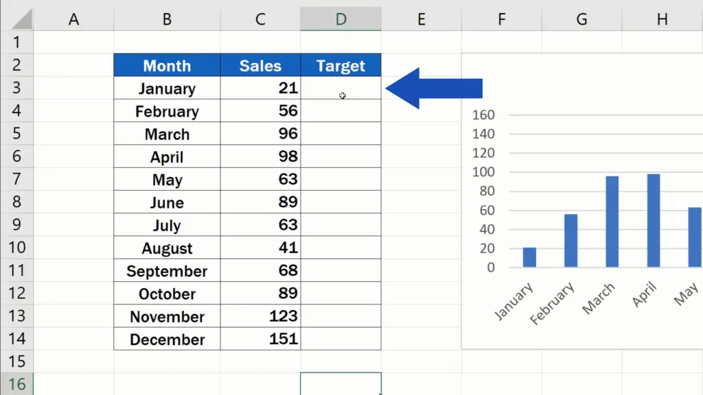
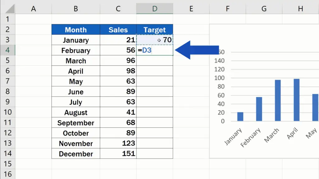
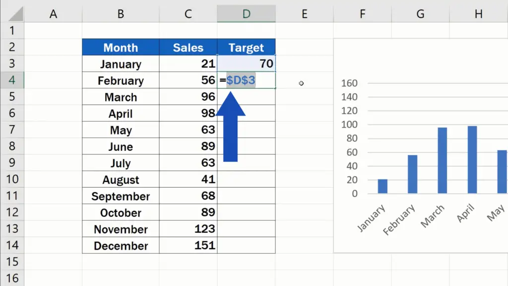
Click into the cell in the first row of the column Target and type in a value, for example 70. It’s quite handy to be able to change this value whenever you need, so we’ll make sure that the rest of the rows will take the target value from this cell.

How to Fix the Cell Reference and Copy the Formula
Click into the cell below, which is D4, type in the equal sign and click again on D3. Now we need to make sure that cell coordinates will not change when this simple formula is copied into the rest of the rows.
Click on the part indicating the cell reference (D3) in the formula, press the Function key and F4. Some of you might not have to press the Function key – this depends on the type of keyboard you’re using.
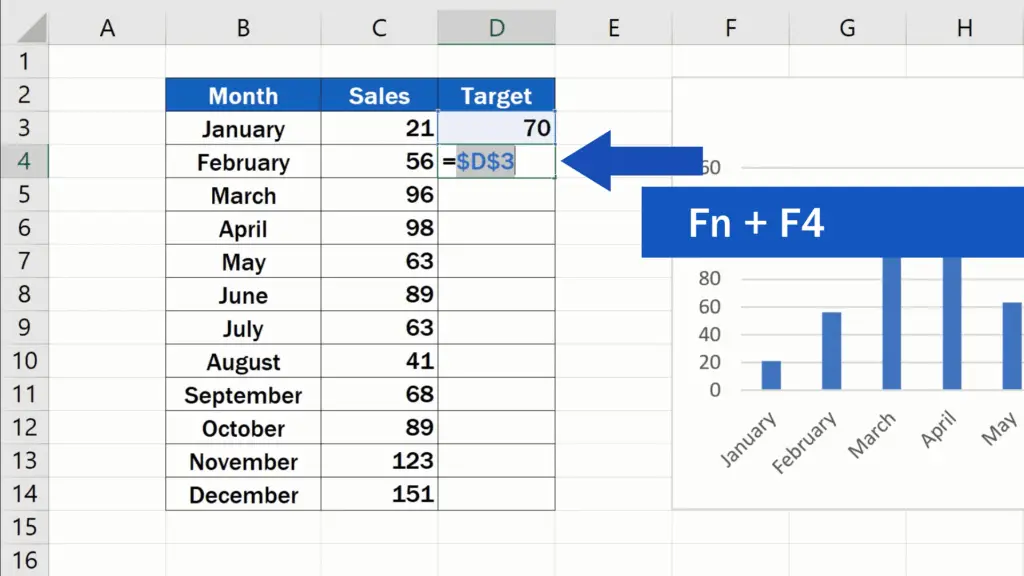
Now you see that the cell coordinates D3 have been marked with dollar signs, which means that the cell reference in the formula is fixed and we can simply copy it by dragging the right bottom corner of the cell to the rest of the rows in the column.
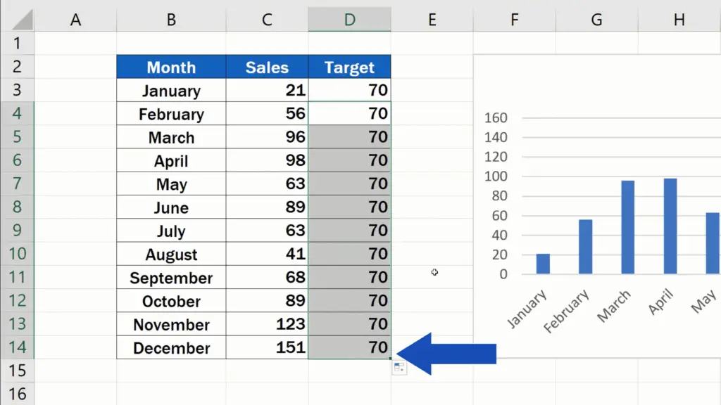
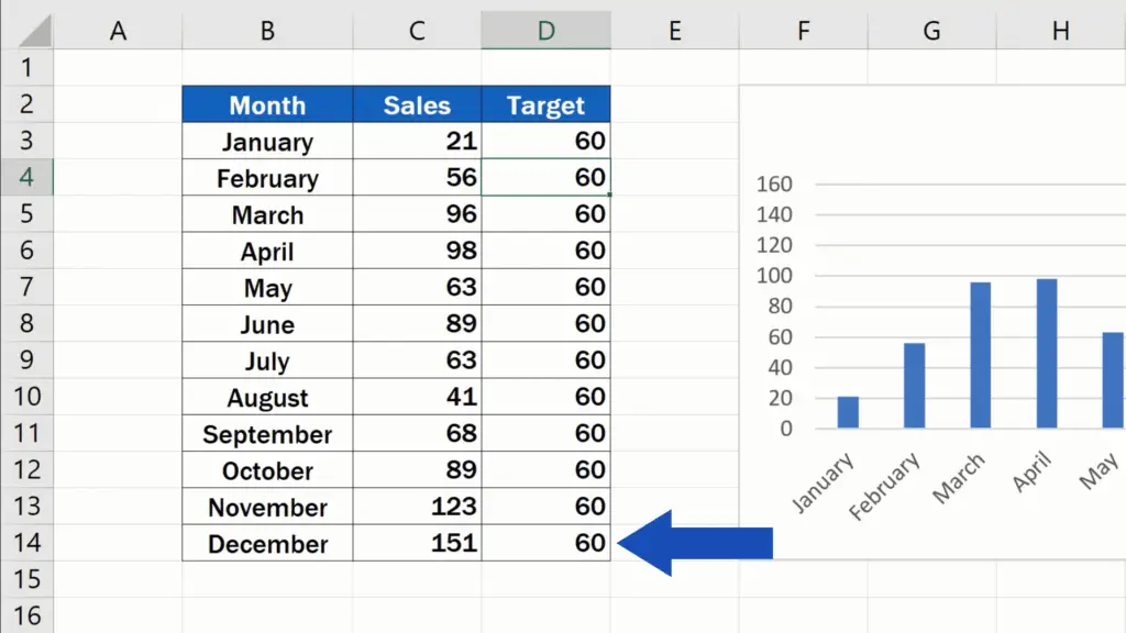
The target value in each row will now always copy the value entered in the cell D3. If we change the number in D3 to – let’s say – 60 and press Enter, the change in the value will be reflected through the whole column.
This has been solved, so let’s carry on now!
How to Show the Target Value as a Horizontal Line in the Graph
We need to show the target value as a horizontal line in the graph. The easiest way to get these new data in the chart is to double-click into the chart area to highlight all the data already shown in the graph.
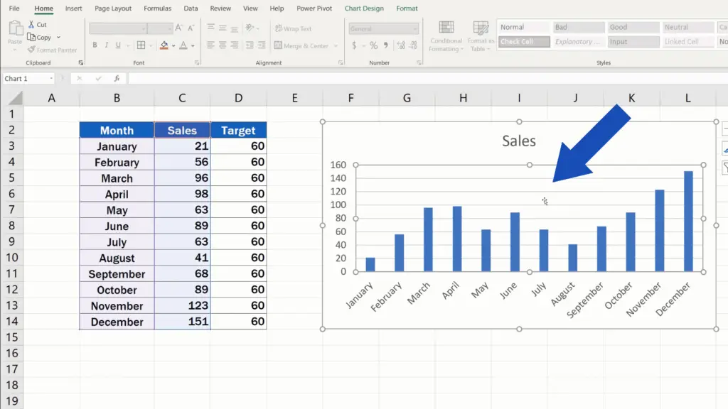
Hover over the bottom right corner and click and drag the highlighted area of the table to extend the selection to the column Target.
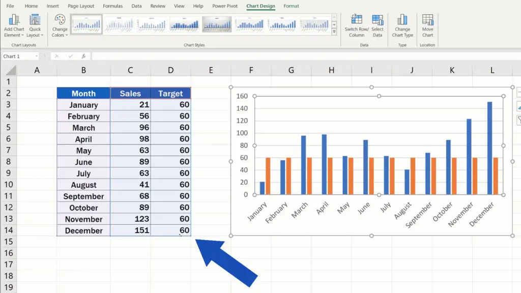
Excel immediately includes this new set of data in the graph.
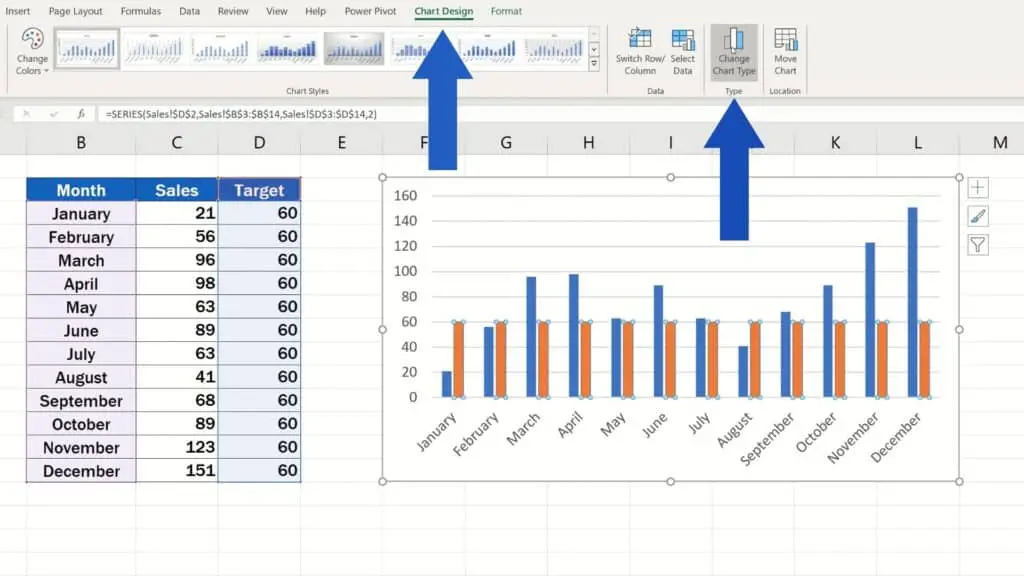
There’s a catch though! The target data are displayed as bars, which is not very convenient. The best way to show the target value across all months would be a horizontal line. So let’s fix this together!
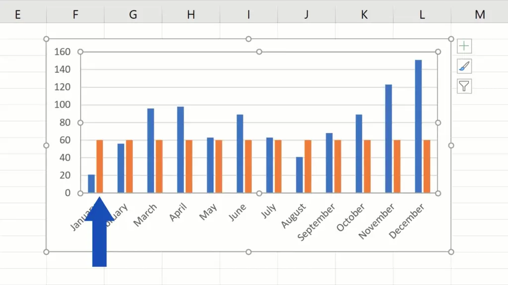
First, click on any bar displaying the target value in the graph. All target values get marked with these small blue circles, which means we can now make changes.
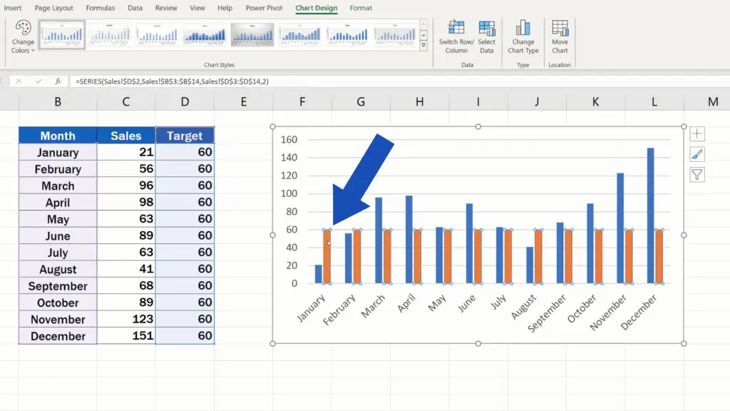
Find the tab Chart Design and select the option Change Chart Type.
But watch out now!
How to Combine Two Types of Graphs
If we select Line here, we’ll get both the Target as well as the Sales data shown as lines, as you can see in this preview.
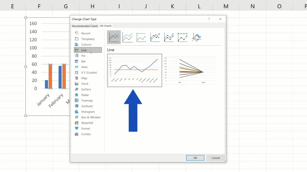
But that’s not what we want. We want to combine two types of graphs, so we’ll go for Combo down here.
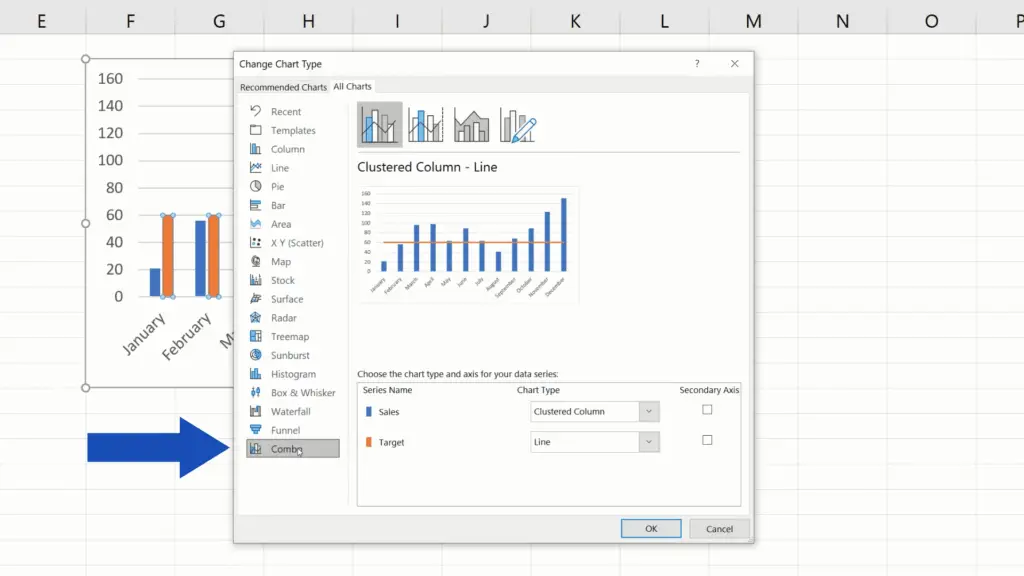
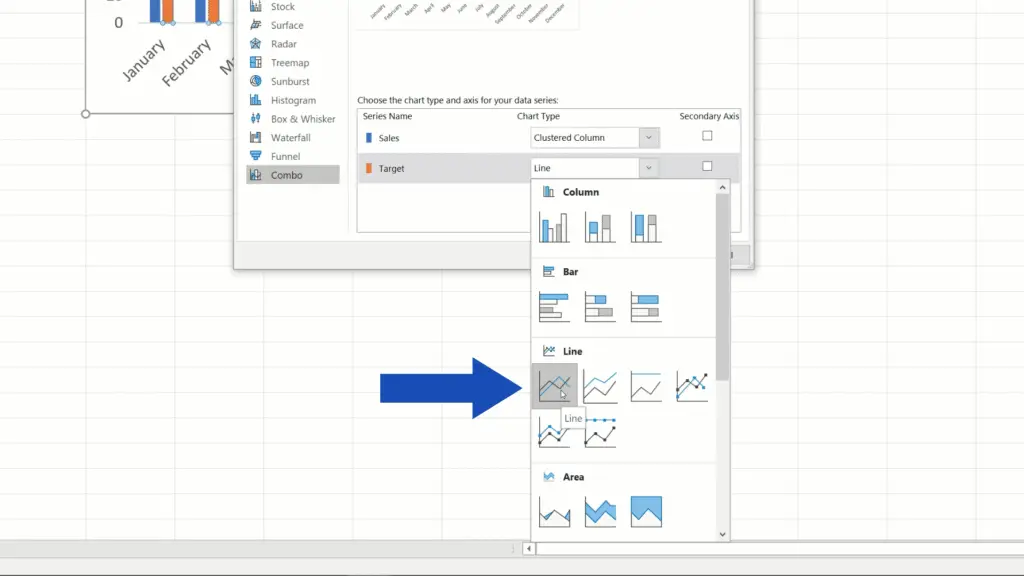
Here we can choose Line only for the Target data, and Excel will show the target value as a horizontal line.
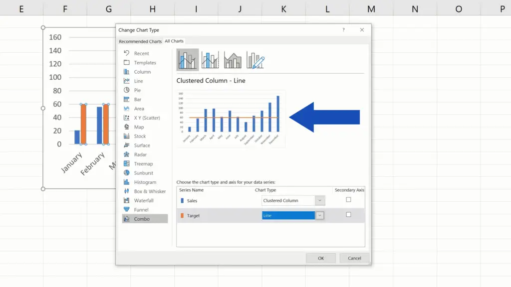
Click on OK and we’ll move on.
A huge advantage of all this is that the whole system is dynamic, which means that if you need to change the value 60 to 80, Excel will refresh the whole table and the data display in the graph, too. So, if you use this way to add the target line, Excel will do all the work of keeping the whole chart up to date for you.

If you’d like to know more about other interesting chart elements, to learn how you can add and format them, have a look at more tutorials by EasyClick Academy. Links to these tutorials are provided in the list below.
Don’t miss out a great opportunity to learn:
- How to Add Axis Titles in Excel
- How to Add a Trendline in Excel
- How to Add an Average Line in an Excel Graph
- How to Change Chart Colour in Excel
- How to Change Chart Style in Excel
If you found this tutorial helpful, give us a like and watch other tutorials by EasyClick Academy. Learn how to use Excel in a quick and easy way!
Is this your first time on EasyClick? We’ll be more than happy to welcome you in our online community. Hit that Subscribe button and join the EasyClickers!
Thanks for watching and I’ll see you in the next tutorial!

 How to Subtract a Percentage in Excel
Welcome! Today we’re going to talk about the simplest way how to…