How to Make a Histogram in Excel
In this tutorial we’re going to have a look at how to make a histogram in Excel, which is one of the ways to create a clear visual representation of data.
So, let’s see how to do that!
Would you rather watch this tutorial? Click the play button below!
In Excel, we can make a neat visual representation of data through different kinds of graphs. In previous tutorials we’ve gone through how to make a line graph, create data bars or draw a pie chart. Today we’ll talk about the histogram.
How to Make a Histogram in Excel
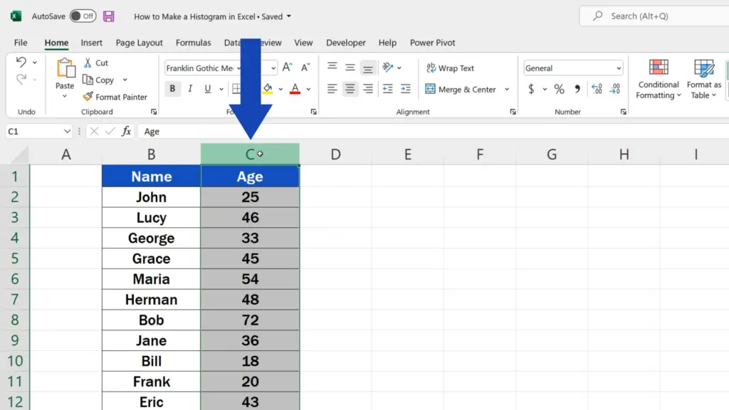
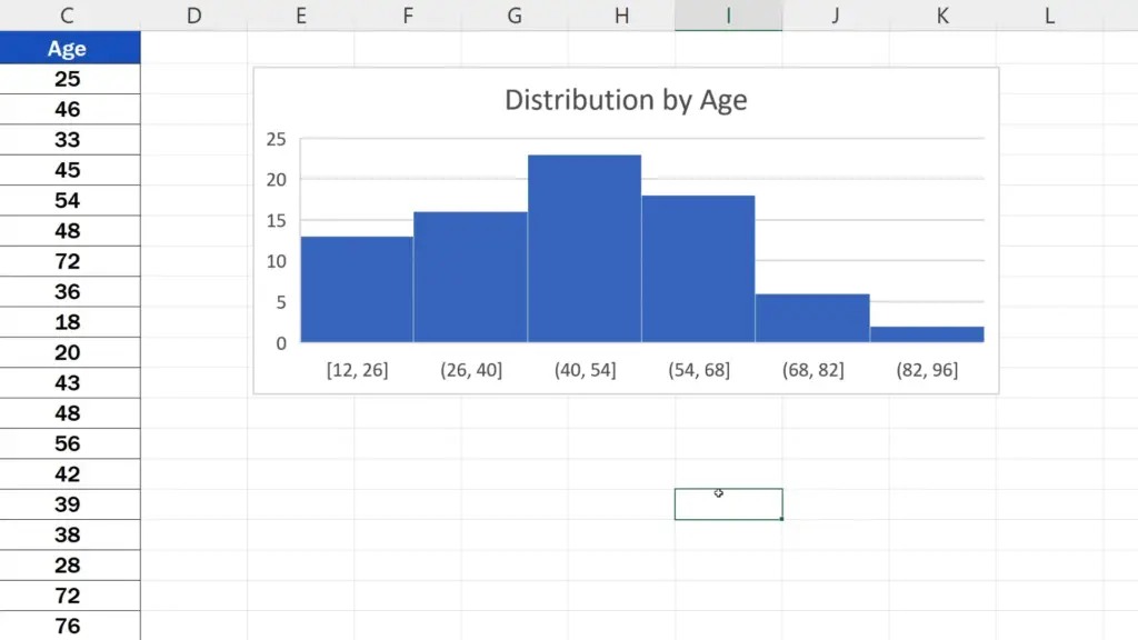
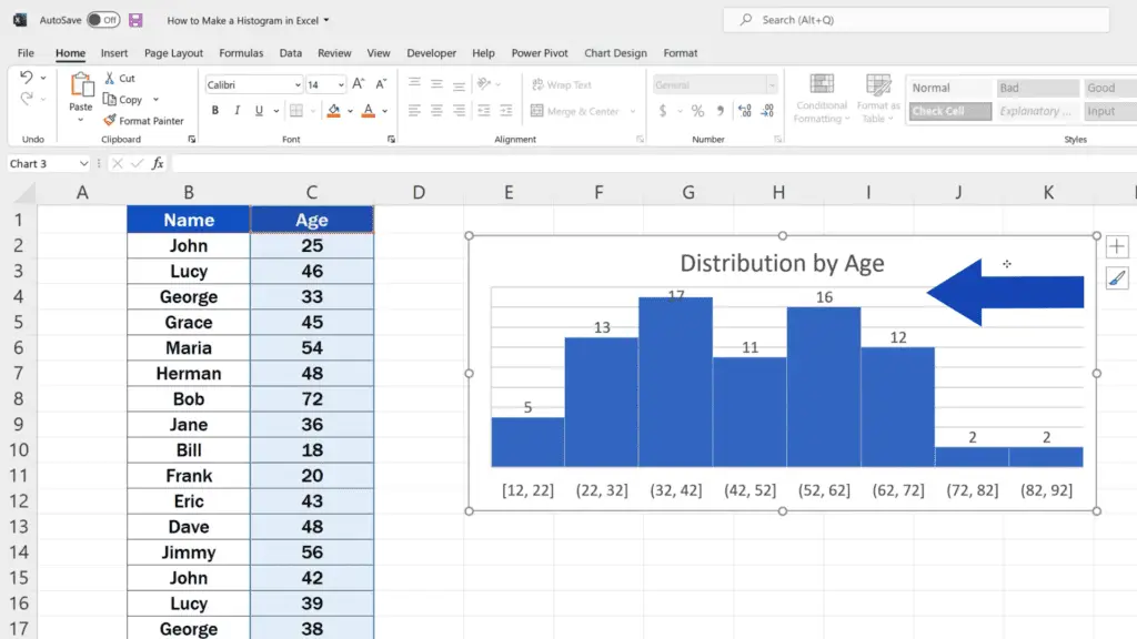
First of all, we need to select the area which contains the data we want to show in a histogram. Here we want to make a histogram that represents the distribution by age, so we’ll select the whole column C.
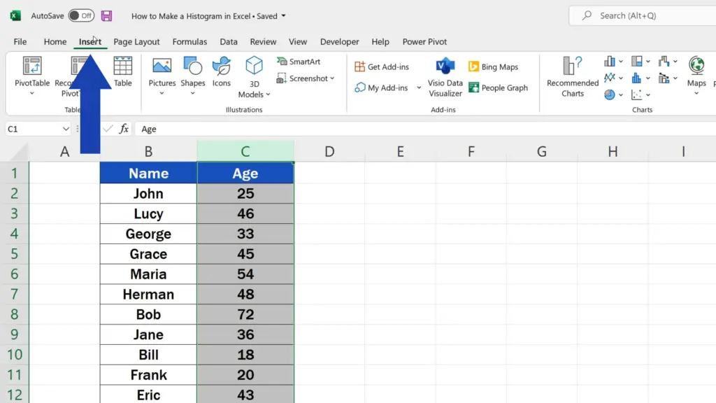
Then we go to the Insert tab, click on the option ‘Insert Statistic Chart’ and choose ‘Histogram’.
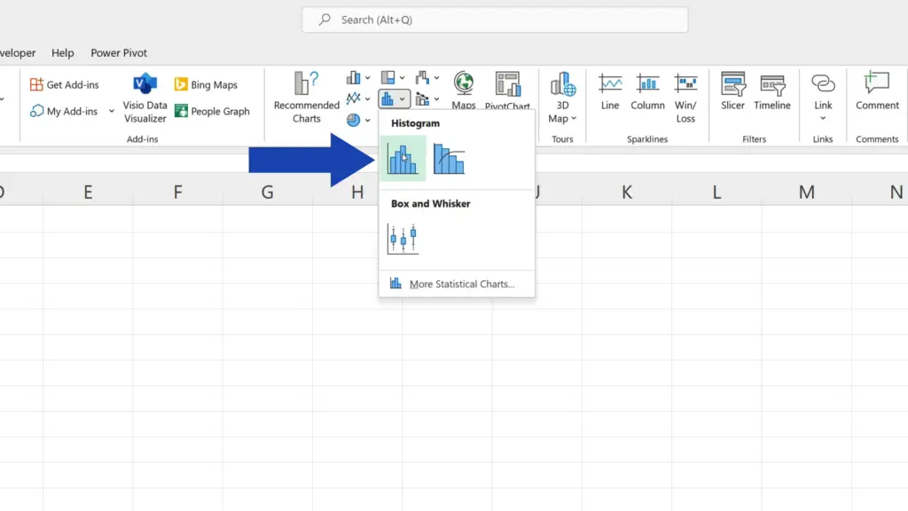
A histogram appears immediately in the spreadsheet area.
Now, we’ve already got the histogram, so let’s take a look at a couple of useful options thanks to which you can customise the graph according to what you need.
How to Adjust the Histogram
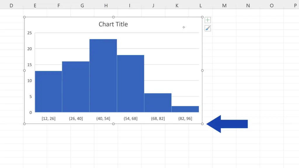
Considering the location, we can change it easily – just click into blank space within the graph area, hold the left mouse button and drag the graph where you need.
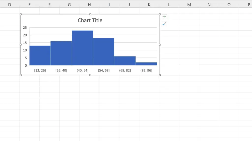
The size of the graph is also adjustable. You can modify it by clicking into one of the corners – on one of these circles – and move the borders of the graph area as you wish.
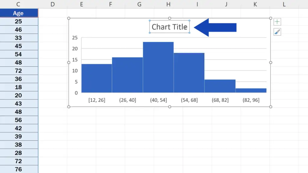
We can also change the title of the histogram by double-clicking on ‘Chart Title’ and simply typing in the new name.
How to Amend the Histogram Itself
And here come a few handy tips on how to amend the histogram itself.
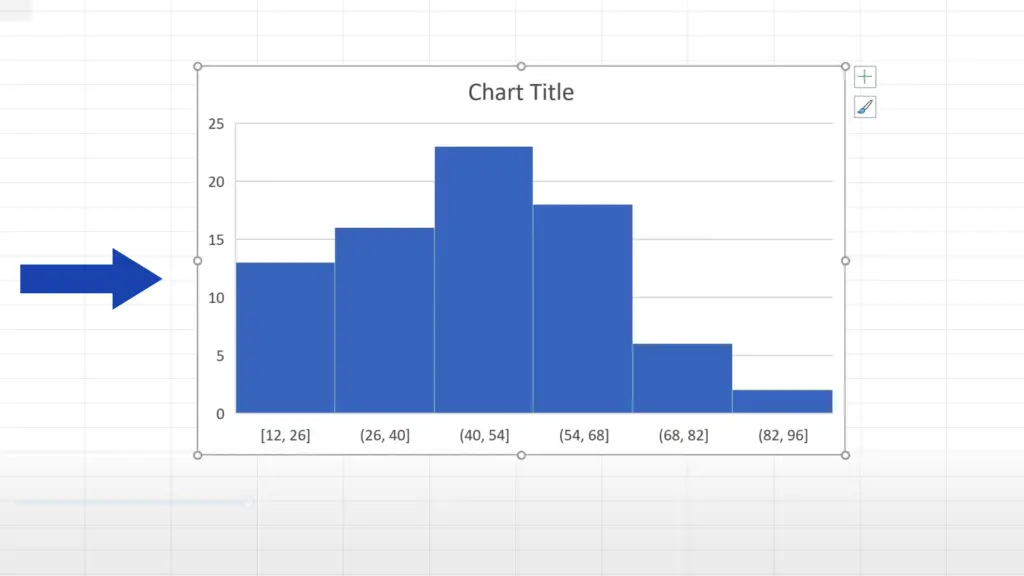
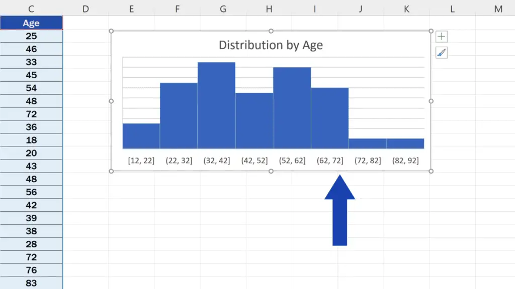
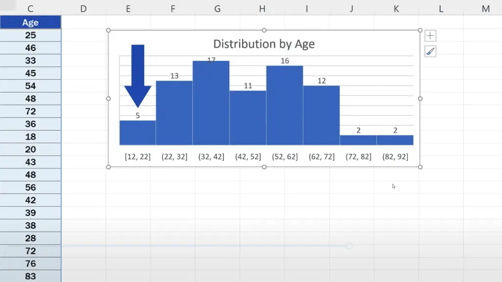
When a histogram is created, all the relevant data is grouped into so-called ‘bins’. These are represented as columns in the graph. Here, we’ve got six of them and each one covers a group of people, each group having an age range of fourteen years.
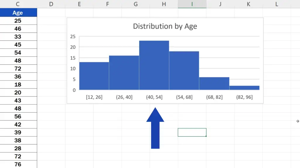
For example, the first bin includes all the people from the data table that fall within the range of 12 to 26 years of age. In the second bin, there are all the people of 26 to 40 years of age, and so on. So, basically, each column covers a span of fourteen years.
To change the age range, right-click on the horizontal axis of the graph and select ‘Format Axis’. You’ll see a pane pop up on the right.
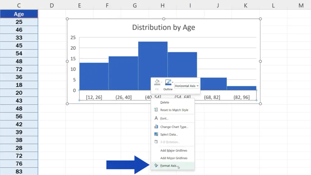
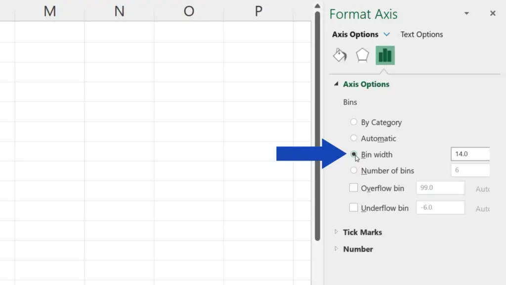
Here you can find and adjust ‘Bin width’ as you need.
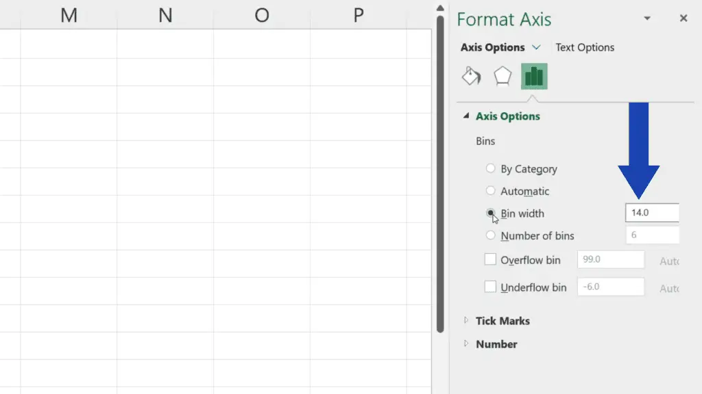
Right now, the span is fourteen years, so let’s change that to ten – rewrite the value in the box, press Enter and here we go – the histogram has reflected the change and each column now covers the age span of ten years.
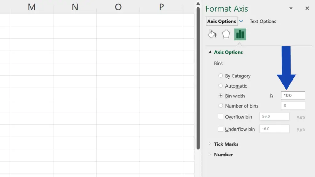
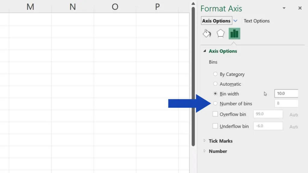
Here below you can also set the number of bins.
But let’s carry on now.
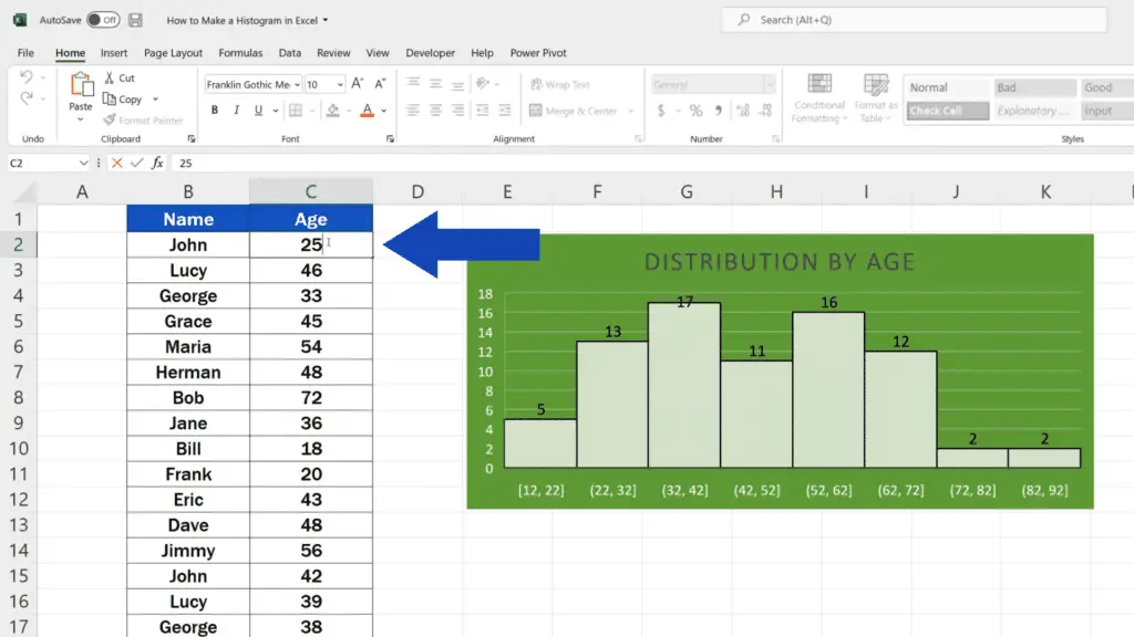
To see how large a particular group is and to have it displayed above each bin, which means you’ll be able to see the exact number of people belonging to that group right away, right-click into the graph and select the option ‘Add Data Labels’.
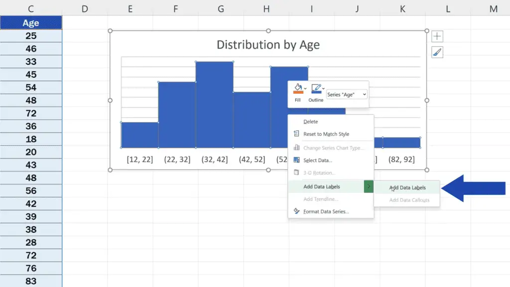
Now we can instantly see that the group of 12 to 22 years of age is made up of five people.
And we’re not finished yet.
How to Change the Style and Design of the Histogram
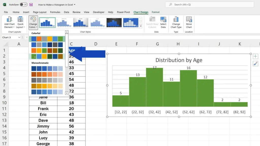
The colour scheme of the histogram can also be modified in a convenient way as well as its style and design. Click into the blank space within the graph area, then go to ‘Chart Design’ and use the button ‘Change Colors’ to pick the colour you like.
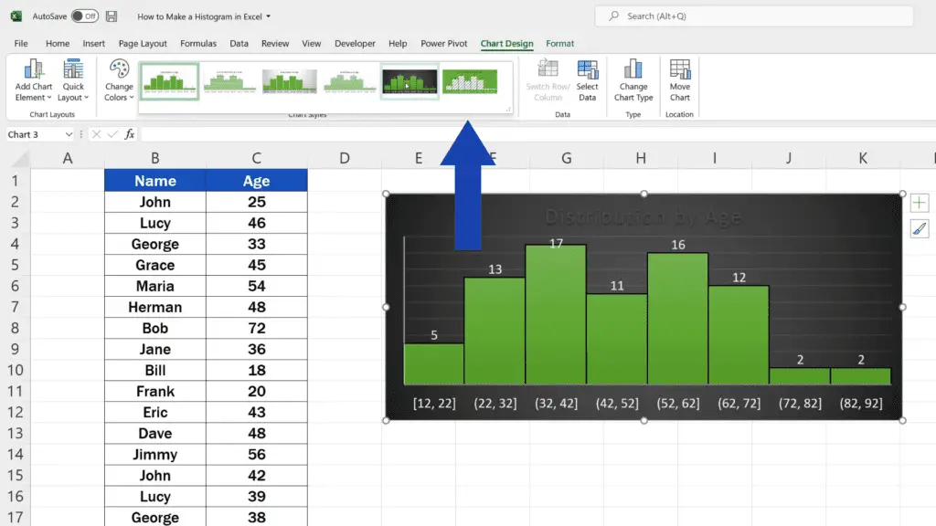
To change the style of the histogram, stay in the tab ‘Chart Design’, click on this downward pointing arrow here in the section ‘Chart Styles’ and choose the design that suits your needs.
And here comes one important thing to remember.
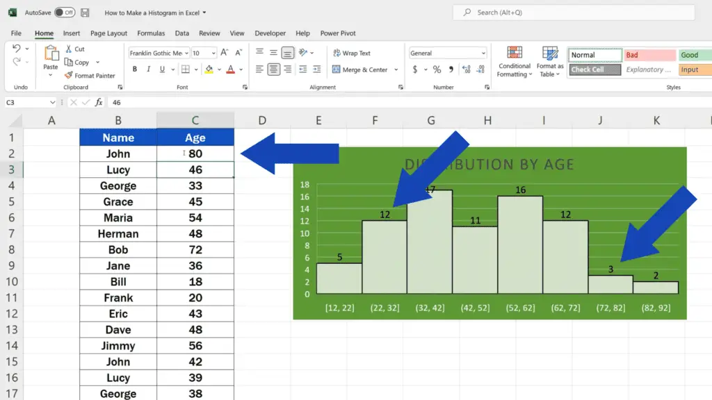
The graph is dynamic and reflects every single change made in the data table. Let’s say we change John’s age in the cell C2 from 25 to 80 – the latest information shows in the graph automatically, which means that value-wise the histogram is always up to date.
If you’d like to know more on how to create other types of graphs or how to format them, watch more video tutorials by EasyClick Academy. Links to the videos are in the list below.
Don’t miss out a great opportunity to learn:
- How to Add a Title to a Chart in Excel (In 3 Easy Clicks)
- How to Change Chart Colour in Excel
- How to Change Chart Style in Excel
If you found this tutorial helpful, give us a like and watch other tutorials by EasyClick Academy. Learn how to use Excel in a quick and easy way!
Is this your first time on EasyClick? We’ll be more than happy to welcome you in our online community. Hit that Subscribe button and join the EasyClickers!
Thanks for watching and I’ll see you in the next tutorial!
 How to Remove a Formula in Excel (The Easiest Way)
Today we’re going to go through the easiest way how to remove…
 How to Highlight Duplicates in Excel (Super Easy)
In this tutorial we’re going to have a look at how to…
 How to Remove Table Formatting in Excel (On Three Different Levels)
Today’s tutorial talks about how to remove table formatting in Excel on…

