How to Use Color Scales in Excel (Conditional Formatting)
In today’s tutorial, we’re gonna talk about how to use colour scales in Excel. Thanks to colour scales, you’ll be able to design a data table with a clear overview of the maximum, the minimum as well as the middle values.
So, let’s get into it!
See the video tutorial and transcription below:
See this video on YouTube:
https://www.youtube.com/watch?v=fj6VtUi2s9s
There are a few ways to use Excel graphical features to make your data presentations attractive. In previous tutorials, we went through various kinds of graphs, charts and data bars among others.
Today, we’ll have a closer look at ‘Color Scales’.
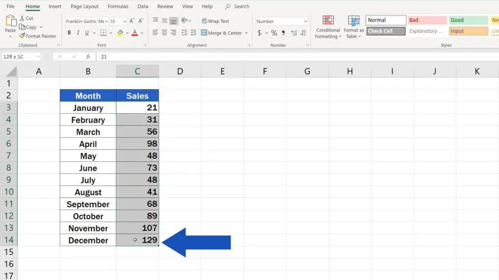
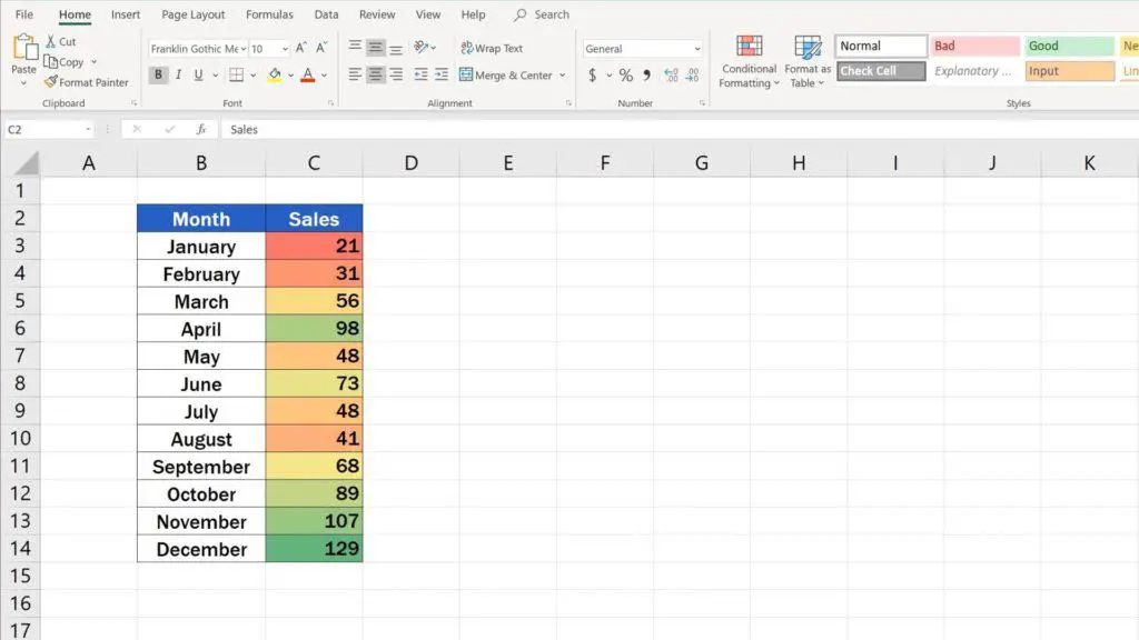
To use this function, you’ll need to select the data range to which you want to apply the colour scales, first.
Then go to the ‘Home’ tab, find ‘Styles’ and click on ‘Conditional Formatting’. There are several useful functions hidden here, in the ‘Conditional Formatting’ section. All of them come quite handy when you need to present your data in a clear way.
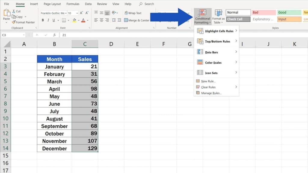
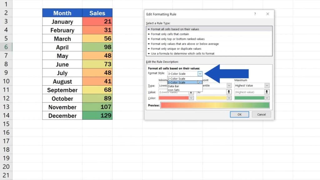
We’ll go for ‘Color Scales’ now and in the window that just appeared, we can select from two types of colour scales.
The first one contains a scale of three colours, the other one just two.
Select the first one: Green – Yellow – Red.
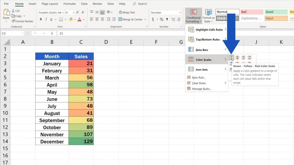
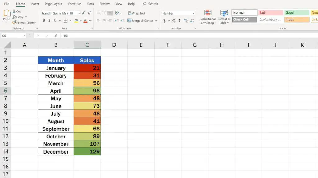
Excel immediately applies a scale in these colours on the selected cells. Red colour marks the minimum, green colour the maximum and the yellow marks the middle values.
Thanks to the different shades of the colours, we’re able to find our way through the set of data and spot quickly whether particular values are closer to the minimum or rather the maximum of the range.
We’re gonna move on now and see how we can edit the colour scale or, if necessary, how we can remove it.
How to Edit the Colour Scale in Excel
Let’s start with the first case, which is editing the colour scale.
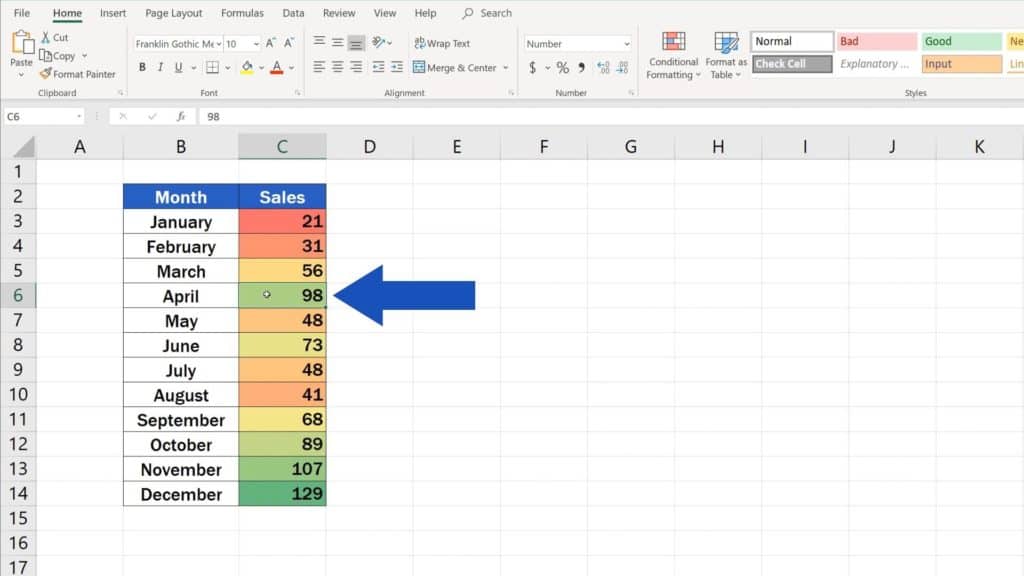
Click on any cell containing the selected data with the colour scale formatting.
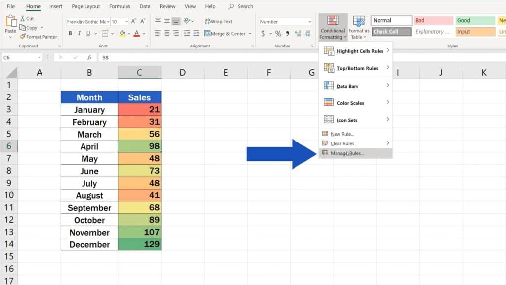
Then click on ‘Conditional Formatting’ again and select ‘Manage Rules’.
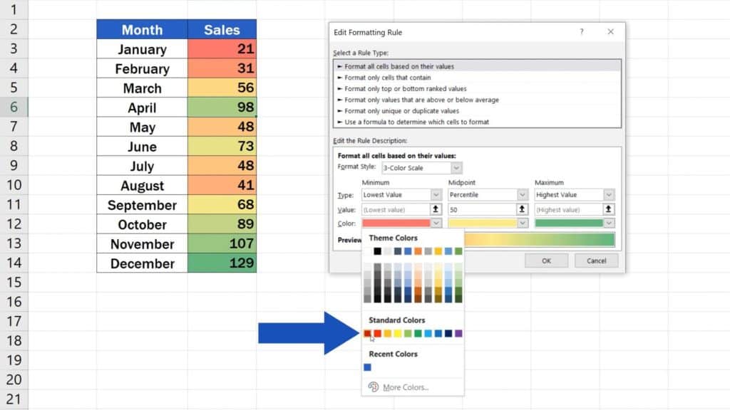
Select ‘Edit Rule’ in the window that just appeared.
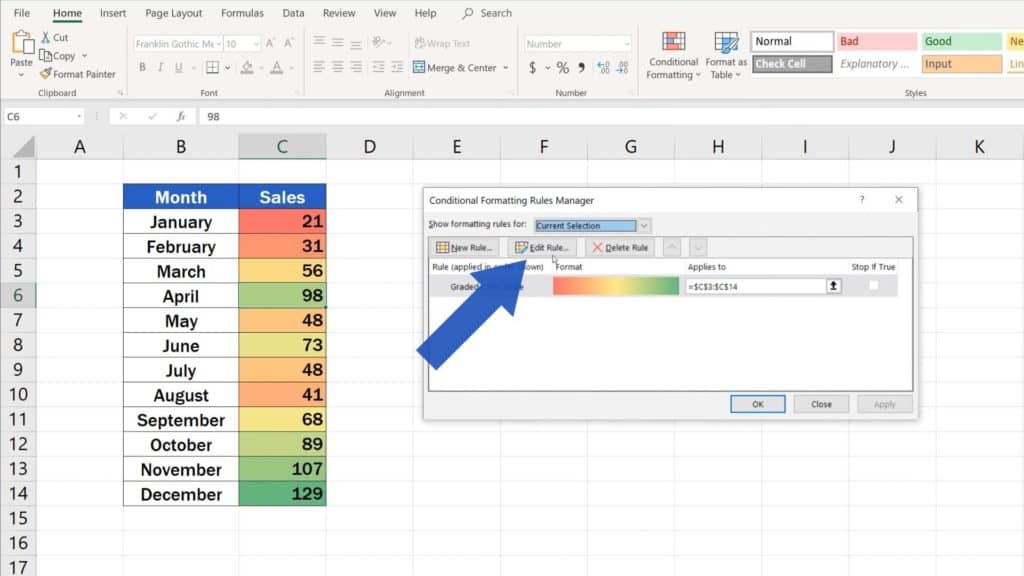
There’s a number of options for editing colour scales here. We’re gonna go only through the basic ones now.
In this part, you can still make up your mind whether you want to change to the two-colour or stick with the three-colour scale.
Below, you can pick specific colours based on what suits you best. In this case, we’ll choose this sharp red for the minimum and intense green for the maximum of the range.
Confirm with OK, then click on OK again.
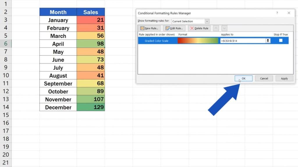
Excel will adjust the scale according to the selected settings.
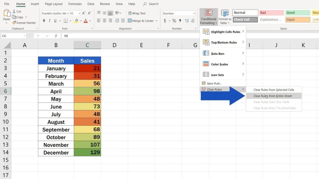
How to Remove Colour Scale in Excel
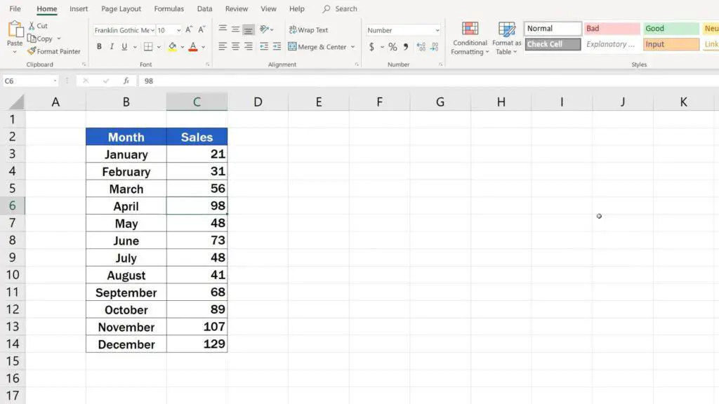
If you need to remove the colour scale, select ‘Clear Rules’ in the section ‘Conditional Formatting’, then click on ‘Clear Rules from Entire Sheet’, and that’s it!
The colour scale has been removed from the table.
If you found this video useful, you can watch more tutorials by EasyClick Academy and learn about the possibilities with graphical data representation in Excel. Check out the links to the videos below!
- How to Visualize Data in Excel
- Try out Data Bars in Excel for clear graphical data representation
- How to Make a Pie Chart in Excel
- How to Make a Bar Graph in Excel
- How to Make a Line Graph in Excel
If you found this tutorial helpful, give us a like and watch other video tutorials by EasyClick Academy. Learn how to use Excel in a quick and easy way!
Is this your first time on EasyClick? We’ll be more than happy to welcome you in our online community. Hit that Subscribe button and join the EasyClickers!
Thanks for watching and I’ll see you in the next tutorial!

 How to Subtract a Percentage in Excel
Welcome! Today we’re going to talk about the simplest way how to…