Try out Data Bars in Excel for clear graphical data representation
If you’re looking for a clear and easy-to-understand way to display data in a table you created, you’re in the right place! This tutorial offers a step-by-step guide on how to add data bars in Excel. Graphical features like data bars highlight important values in the table and point out how these are related. You’ll also see how easy it is to edit data bars or place them separately, in an individual column.
Let’s give it a try!
See the video tutorial and transcription below:
See this video on YouTube:
https://www.youtube.com/watch?v=pMbBZzlPdrQ
Graphical representation of data in Excel is not limited to only one feature. We’ve already seen how we can use a lot of different types of graphs.
Today we’ll talk about data bars.
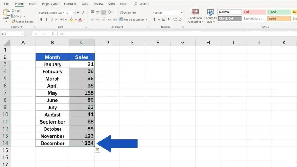
To display data bars, first you need to select the relevant data – the data which should be taken into account when creating the graph.
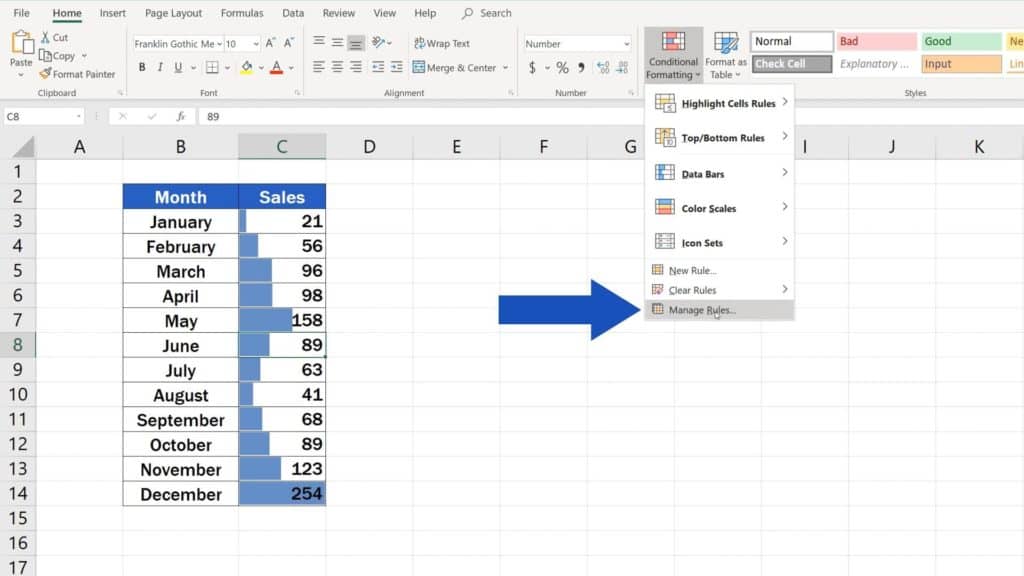
Then go to the ‘Home’ tab, find the group ‘Styles’, and click on ‘Conditional Formatting’, which contains multiple useful features for clear graphical data representation.
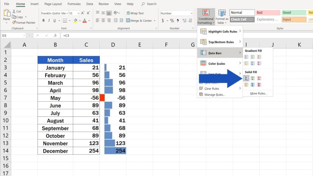
Here, we’ll go for the option ‘Data Bars’. In this window, you can choose the colour and type of the data bars, for example, you can pick whether you want them gradient or solid.
As for the colour – for now, let’s choose blue. Great!
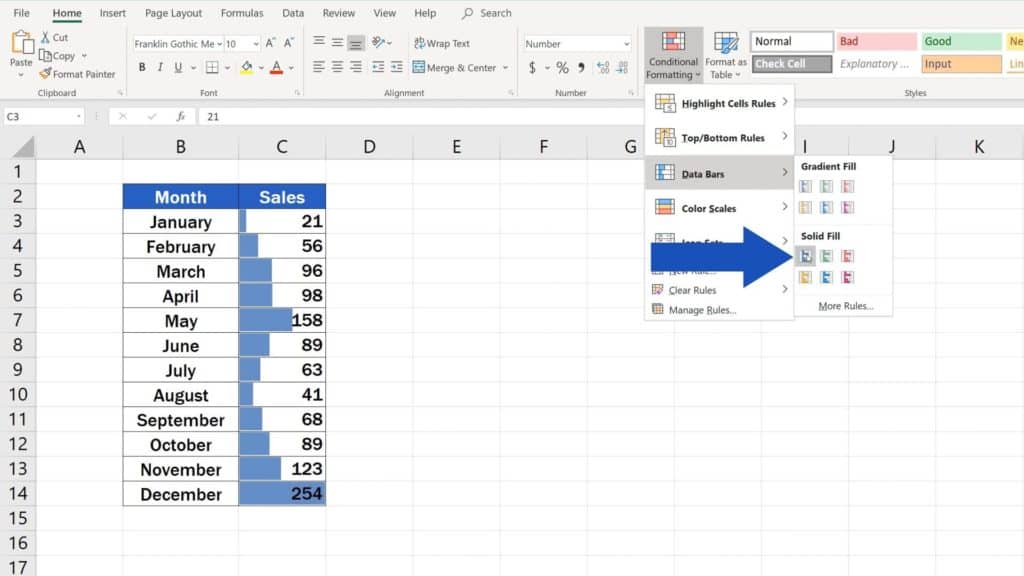
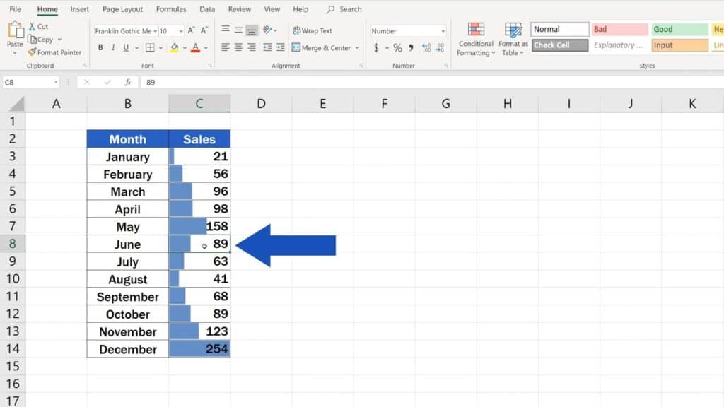
Thanks to the function ‘Data Bars’, our data are presented nice and neat, cell by cell.
But there’s more to that.
How to Edit Data Bars in Excel
If you ever needed to edit the data bars, click anywhere within the selected data range.
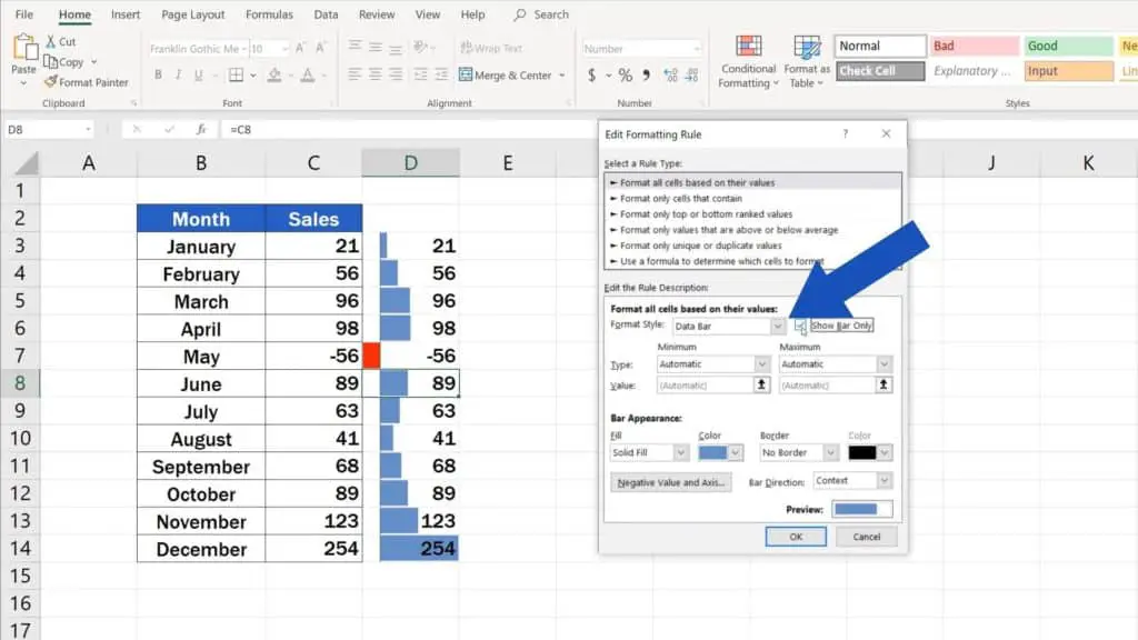
Then go back to ‘Conditional Formatting’ and find the option ‘Manage Rules’.
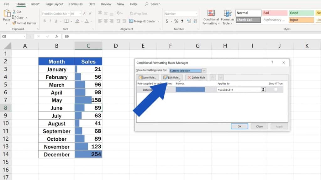
You’ll see this pop-up window, where you click on ‘Edit Rule’.
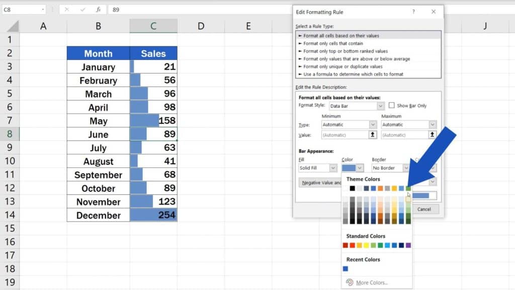
Now you can see everything we can change on the data bars design. Let’s just discuss the basic features here.
In this part, you can additionally change the colour of the bars. Depends on what you need. I’ll choose, for example, this green.
If there are any negative values in the table, click on the button ‘Negative Value and Axis Settings’ and you’ll be able to set a colour for negative numbers.
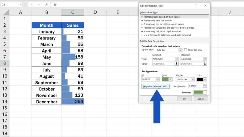
Red’s the default option, but of course, you can pick any colour you need.
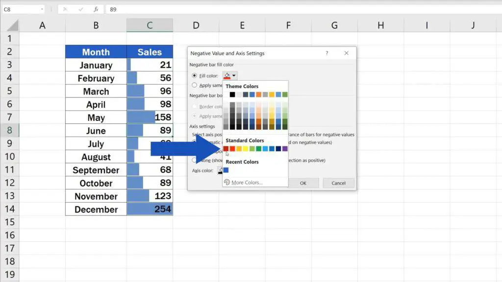
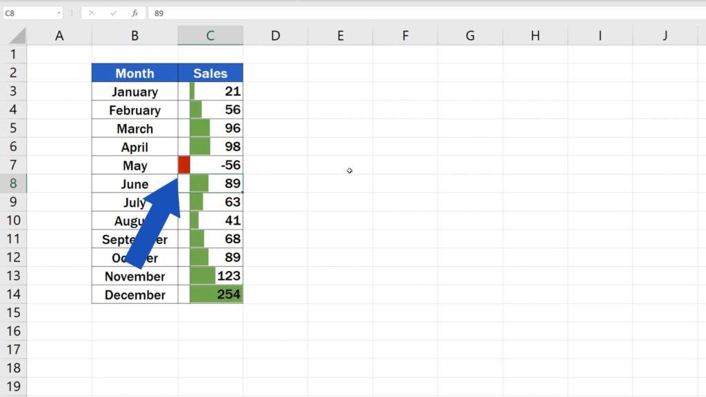
Click on OK and then OK again to confirm the changes. As you can see, our data bars turned green. Let’s try to change the May value to a negative number and see what happens. The negative value is now represented by a red bar and what’s even better – you know now, how to change it if needed.
How to Remove Data Bars in Excel
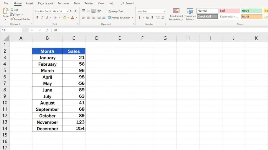
Let’s move on! Imagine you want to remove data bars completely. What to do? Go to ‘Conditional Formatting’ again and select ‘Clear Rules’. Go ahead with ‘Clear Rules from Entire Sheet’ and that’s it!
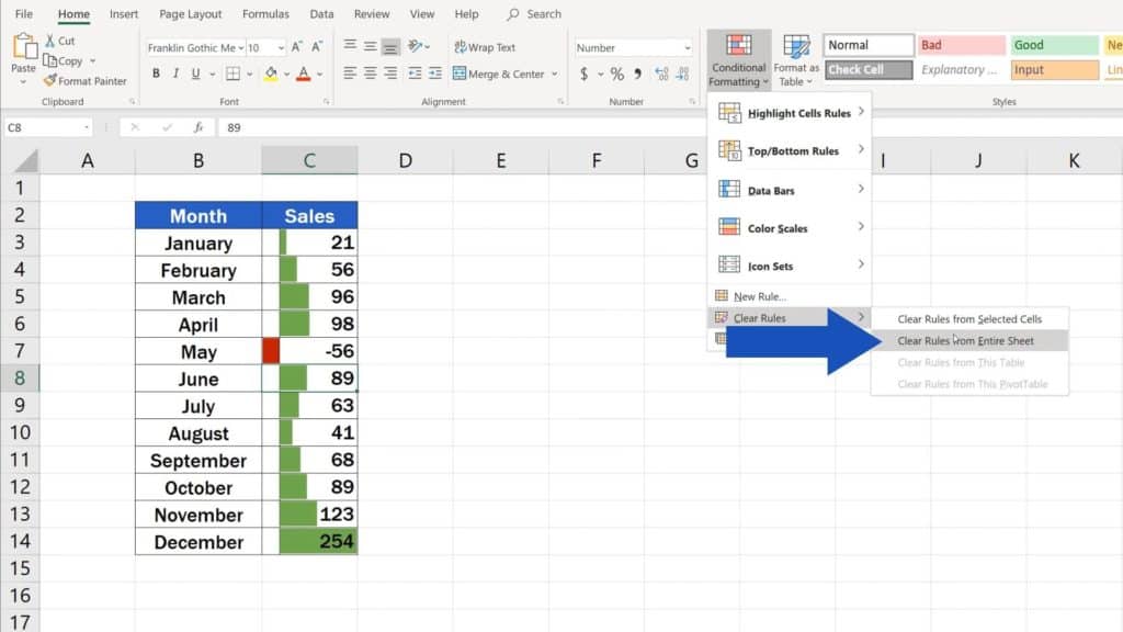
You’ve successfully removed data bars from the table.
How to Place Data Bars in a Separate Column
Last but not least, here comes the question how to place data bars in a separate column, in our case, column D.
First, we need to get the values from the column C to the column D. Click on the cell D3, type in the equal sign and mark the cell C3 as the source cell for the value that should appear in the column D.
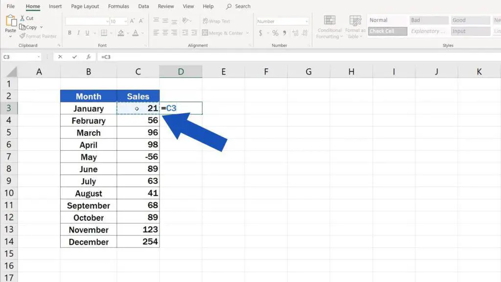
Now click and drag the bottom right-hand corner of this cell up to the point where you need the formula to be copied.

And now we’ll be working through the steps you’re already familiar with. Select the relevant cells, go to ‘Conditional Formatting’, then ‘Data Bars’ and pick the colour.
And here’s an important piece of advice.
If you want the data bars in the column D to display without the numbers, you’ll need to do that through ‘Edit Rule’, just as we did before.
So, select the range, go to ‘Conditional Formatting’, then ‘Manage Rules’. Click on ‘Edit Rule’ and make sure that the option ‘Show Bar Only’ has been selected.
Click on OK to confirm. Well done!
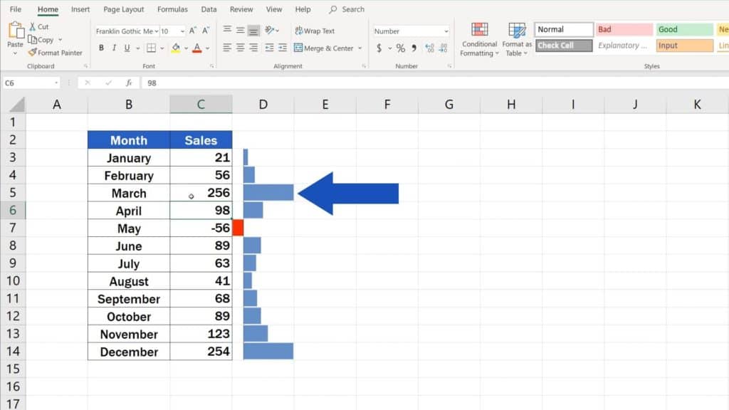
Data bars appear clearly in a separate column, but if we change any value in the column C, it will show on the bar in the column D, too.
If you liked this video and want to know more on how to represent data graphically in Excel, click on the links below to find further tutorials by EasyClick Academy!
- How to Highlight Blank Cells in Excel (Conditional Formatting)
- How to Make a Pie Chart in Excel
- How to Use Color Scales in Excel (Conditional Formatting)
- How to Make a Line Graph in Excel
- How to Make a Bar Graph in Excel
If you found this tutorial helpful, give us a like and watch other video tutorials by EasyClick Academy. Learn how to use Excel in a quick and easy way!
Is this your first time on EasyClick? We’ll be more than happy to welcome you in our online community. Hit that Subscribe button and join the EasyClickers!
Thanks for watching and I’ll see you in the next tutorial!

 How to Subtract a Percentage in Excel
Welcome! Today we’re going to talk about the simplest way how to…