How to Make a Scatter Plot in Excel
Here we come with another quick and easy video tutorial on how to make a simple scatter plot in Excel, which is useful if you want to make a visual representation of a relationship between two separate sets of data.
Let’s have a look at how to do that!
Would you rather watch this tutorial? Click the play button below!
In Excel, there are various types of charts available to visually display collected data. In previous tutorials, we had a look at how to create a line graph or a bar chart. Here we’ll focus on the scatter plot, which we’ll use to show the relationship between Cost and Profit.
Before we get started though, it’s essential to point out a couple of important details.
First, it’s crucial to realise that unlike other chart types, the scatter plot standardly works with numbers. The x- as well as y-axis will consist of numerical data only.
How to Prepare Clear Data Table in Excel Chart
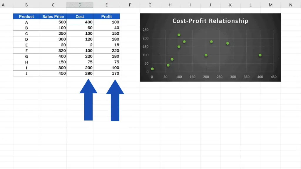
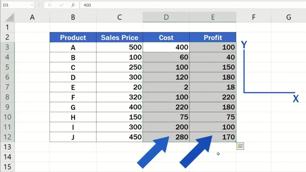
Then it’s good to know that well prepared data within a clear table can be of great help, because when you simply select two columns with values to be used in the plot, the column on the left will appear on the horizontal x-axis and the column on the right will be displayed on the vertical y-axis. Therefore, take your time and make sure to organise the collected data within a table with great care.
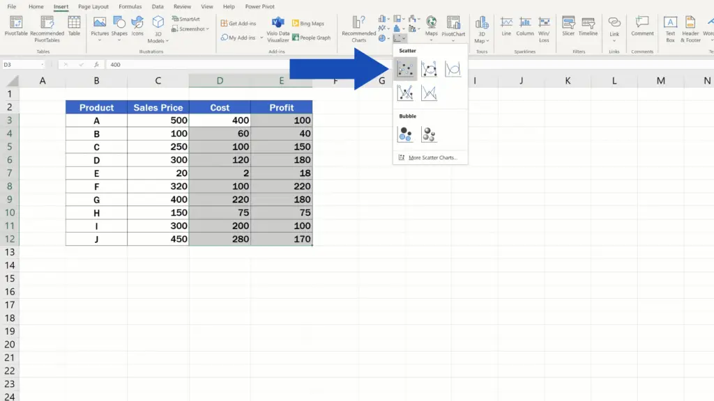
Once a clear data table has been prepared and we’ve selected the values to be used in the chart, we can insert the scatter plot in several easy clicks.
How to Make a Scatter Plot in Excel
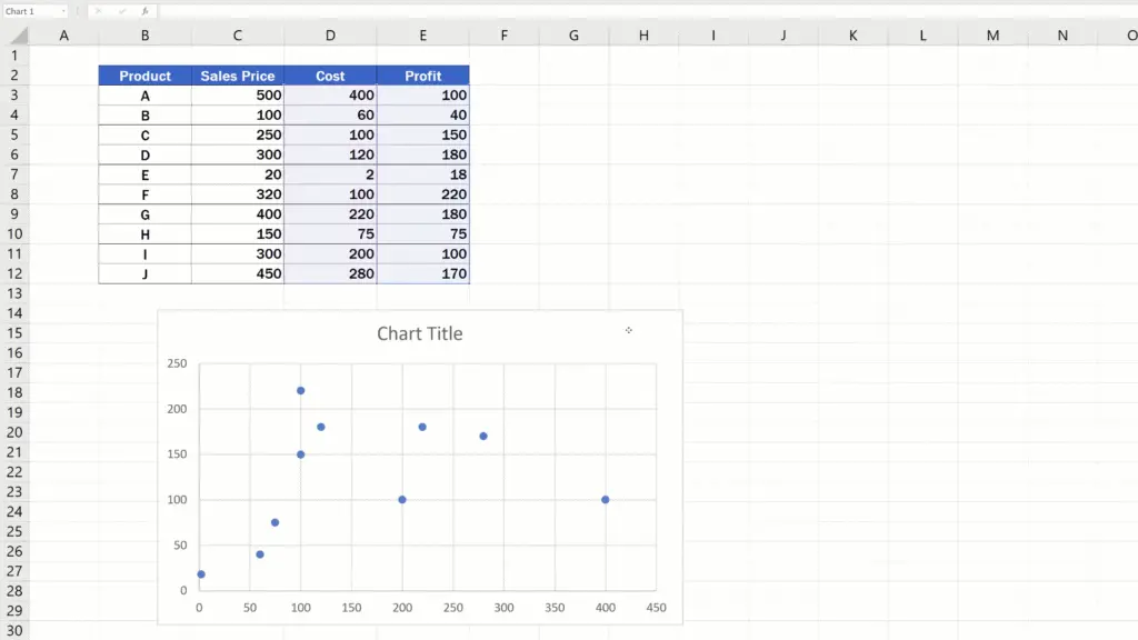
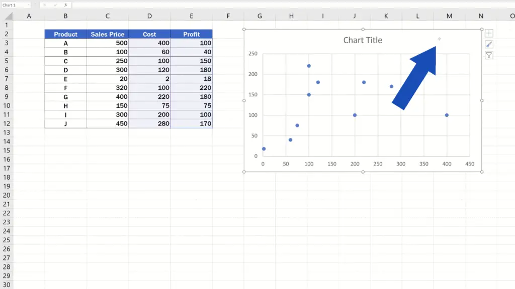
Go to the Insert tab, find Charts and the option Scatter.
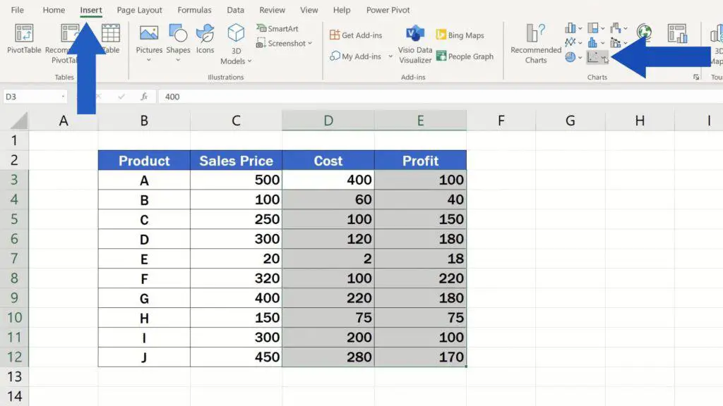
Click on it. There are numerous possibilities to choose from. We’ll use this simple scatter plot – the first one at hand. Excel will create the scatter plot and insert it within the area of the sheet.
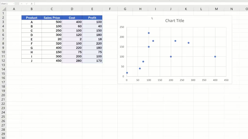
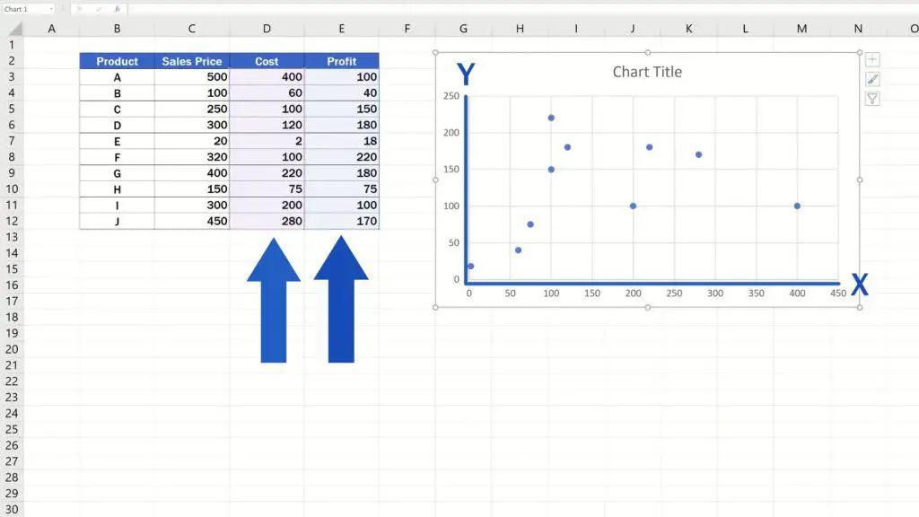
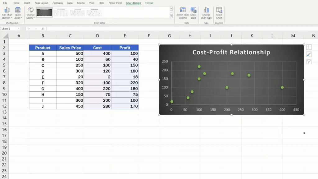
Just as we mentioned a while ago, the values from the column on the left – Cost – are on the x-axis and the data from column on the right – Profit – show on the y-axis.
The dots we see in the plot are the points where the values for Cost and Profit intersect on the x- and y-axes. For example, this point here shows the Cost-Profit relationship for the product A, where the Cost value is 400 and the Profit value 100.
The scatter plot is great for a visual representation of a relationship between any sets of data.
Let’s have a closer look now at several possibilities how we can modify the plot to achieve the result we need.
How to Modify the Plot to Achieve the Result You Need
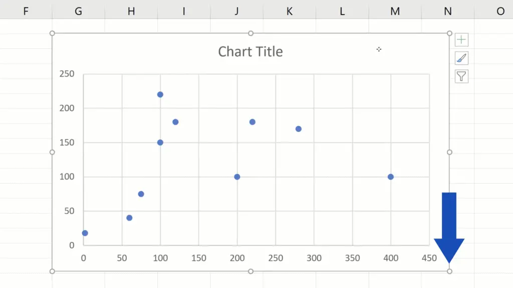
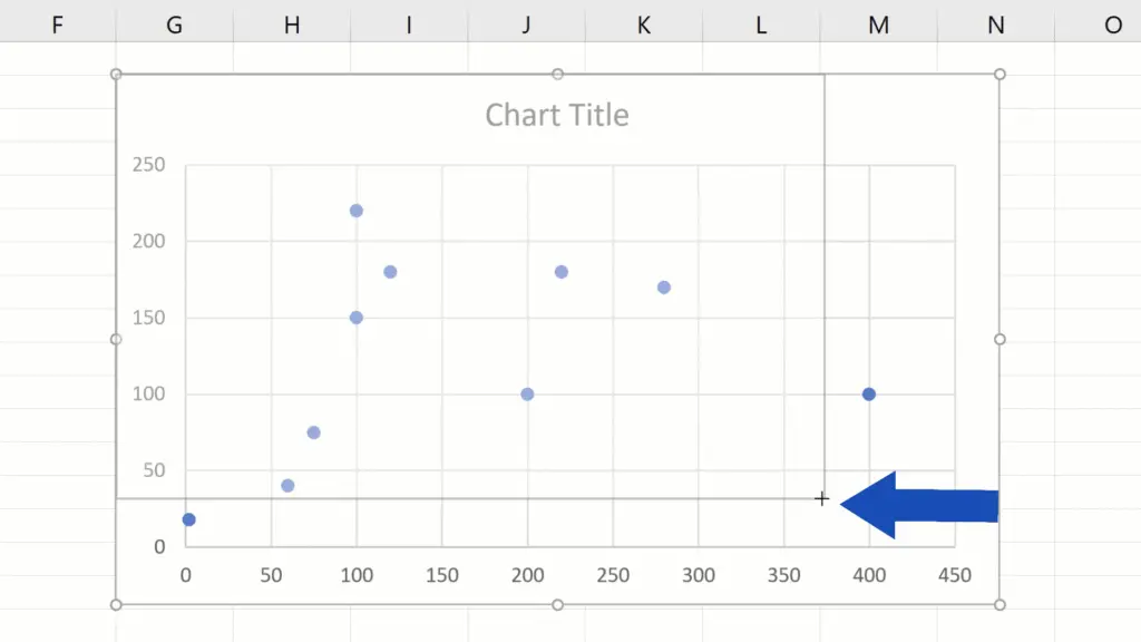
The position of the chart in the sheet can easily be adjusted just by clicking anywhere into the empty space of the chart area, holding the left mouse button and dragging the whole chart wherever in the sheet you need.

To change the size of the chart, click on any corner of the chart area and adjust the size by dragging one of the empty circles.
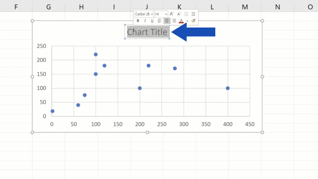
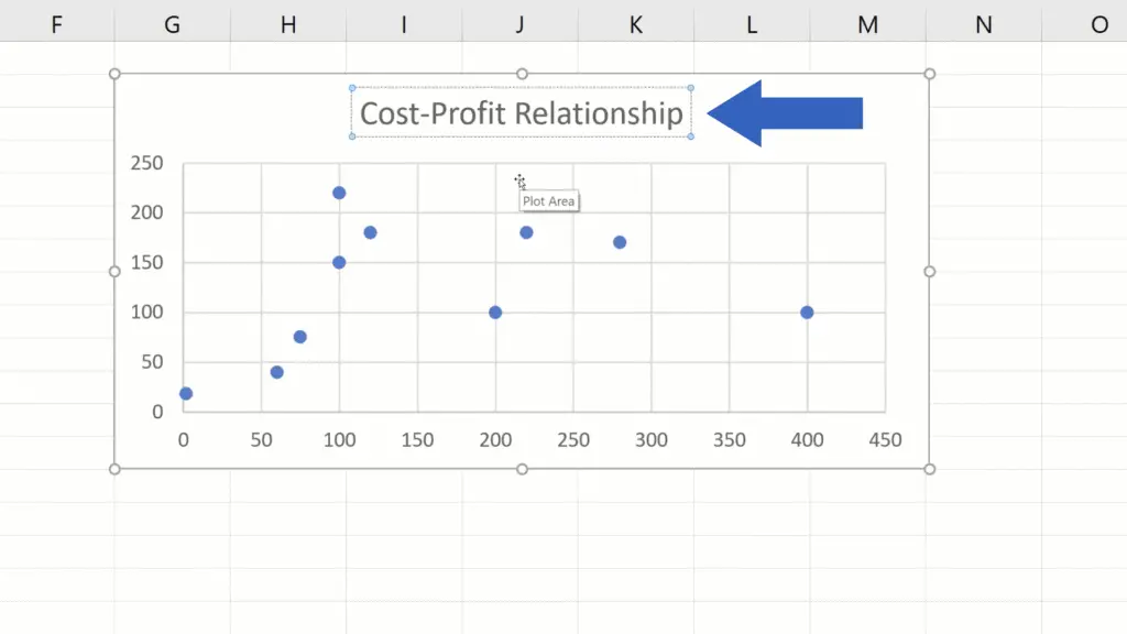
And if you click on the Chart Title, you can change the chart name to any text you want. We’ll go for ‘Cost-Profit Relationship’ here.
And let’s keep going!
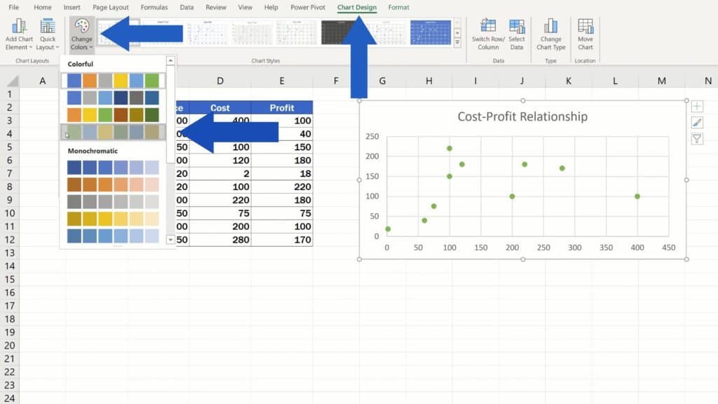
If you need to choose a suitable colour or chart style, click on the empty space in the chart area again, go to the Chart Design tab and through the button ‘Change Colors’, you can choose a colour to your liking, whichever you need.
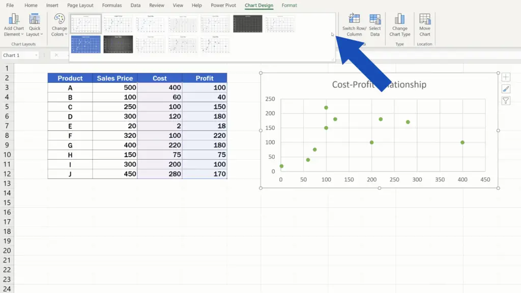
To change the chart style, stay in the Chart Design tab – Chart Styles and click on this arrow pointing downwards. You’ll see different plot styles you can select from. Pick the one that best suits your needs.
Now one more thing to remember.
The Dynamic Function of the Plot
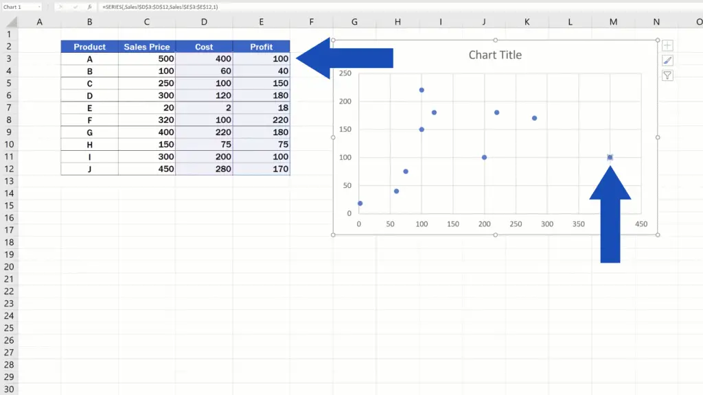
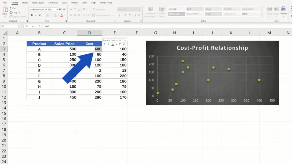
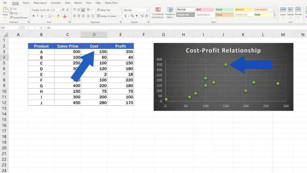
The plot is dynamic, which means that when you rewrite any value within the data table, the change gets automatically reflected in the plot. Let’s say we’ll take the value 400 for the product A and rewrite it to 150 instead. You can see that the position of the point for the product A in the plot has changed, too.
If you’re curious to know when to use and how to create other chart types or how to modify these charts, you can find it all in our EasyClick tutorials. Separate tutorial allow you to find and watch just what you want. Check out the links to these videos in the list below!
Don’t miss out a great opportunity to learn:
- How to Add a Title to a Chart in Excel
- How to Rename a Legend in an Excel Chart
- How to Make a Bar Graph in Excel
- How to Use Color Scales in Excel (Conditional Formatting)
If you found this tutorial helpful, give us a like and watch other tutorials by EasyClick Academy. Learn how to use Excel in a quick and easy way!
Is this your first time on EasyClick? We’ll be more than happy to welcome you in our online community. Hit that Subscribe button and join the EasyClickers!
Thanks for watching and I’ll see you in the next tutorial!

 How to Subtract a Percentage in Excel
Welcome! Today we’re going to talk about the simplest way how to…