How to Use the TREND Function in Excel
Today we’ll be talking about how to use the TREND function in Excel. This interesting feature provides a realistic forecast based on past data.
Let’s have a look!
How to Choose the Right Data for the TREND function
To begin with, it’s important to note that the TREND function is great when the data you’re working with show a steady rise or drop, which happens in cases such as revenue trends, population growth, average temperature, and others similar to these. However, if the data are not steady and they don’t show a clear direction, for example, the value of cryptocurrencies or stock market shares, the TREND function is not as effective and might provide distorted results.
So, we need to bear in mind that this function is useful only when working with suitable data.
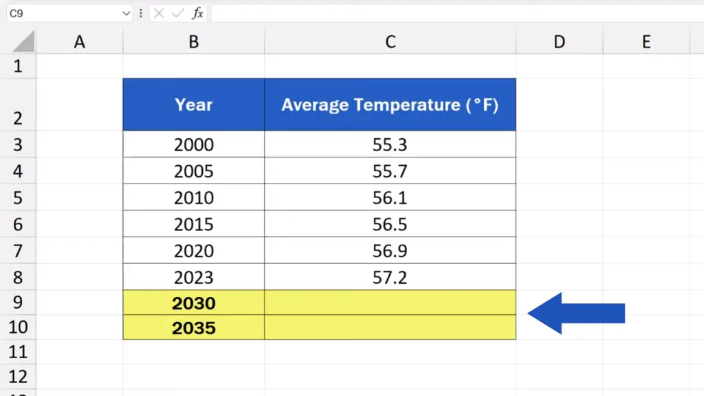
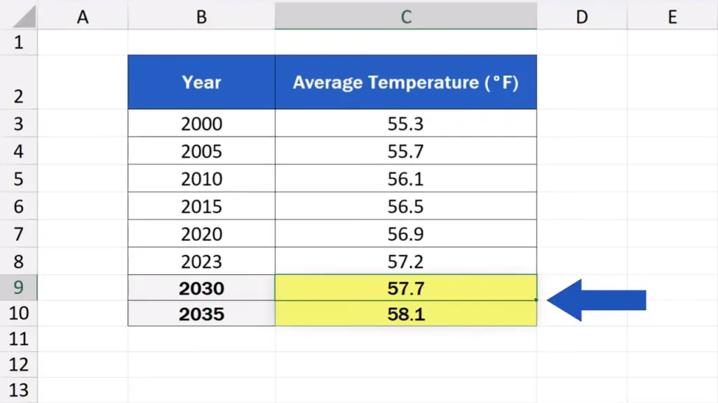
What we’ll have a look at today is a development over time of the average annual temperature in New York. Thanks to the TREND function, we’ll make a prediction of the temperature for the upcoming years, for instance, for the years 2030 and 2035.
So, let’s get into it!
How to Fill in the TREND Function Step by Step
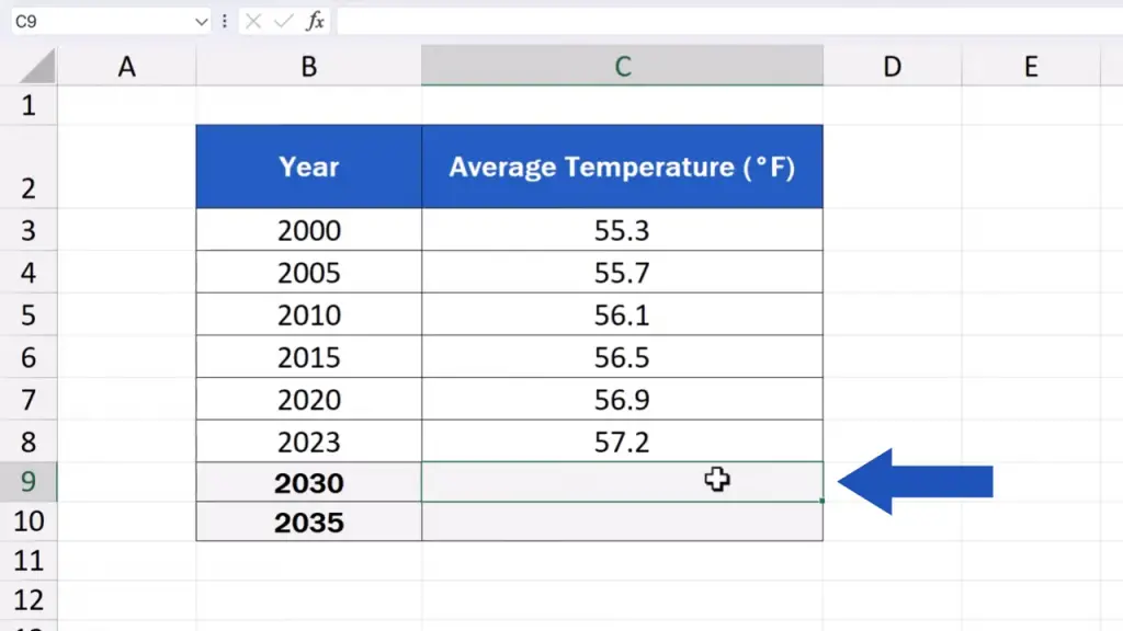
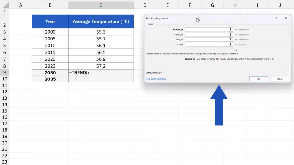
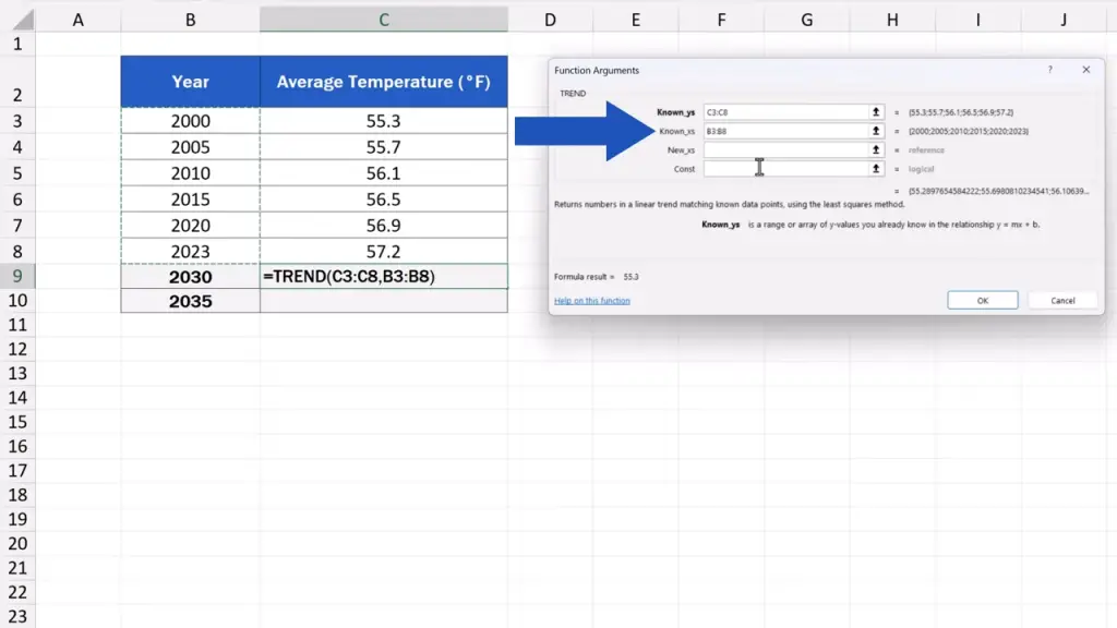
First, we click on our target cell, which is the cell where we want the forecast to appear. In our case, it’s the cell C9 to calculate the temperature forecast for the year 2030.
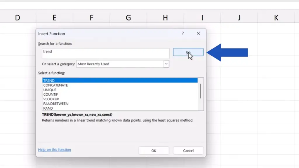
Then we click on the ‘fx’ icon next to the formula bar.
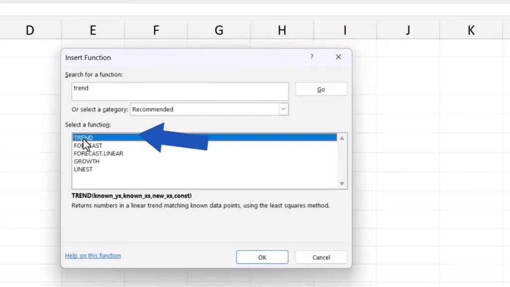
We look up the TREND function and click on OK.
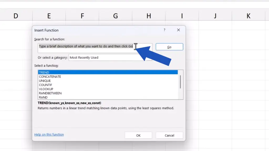
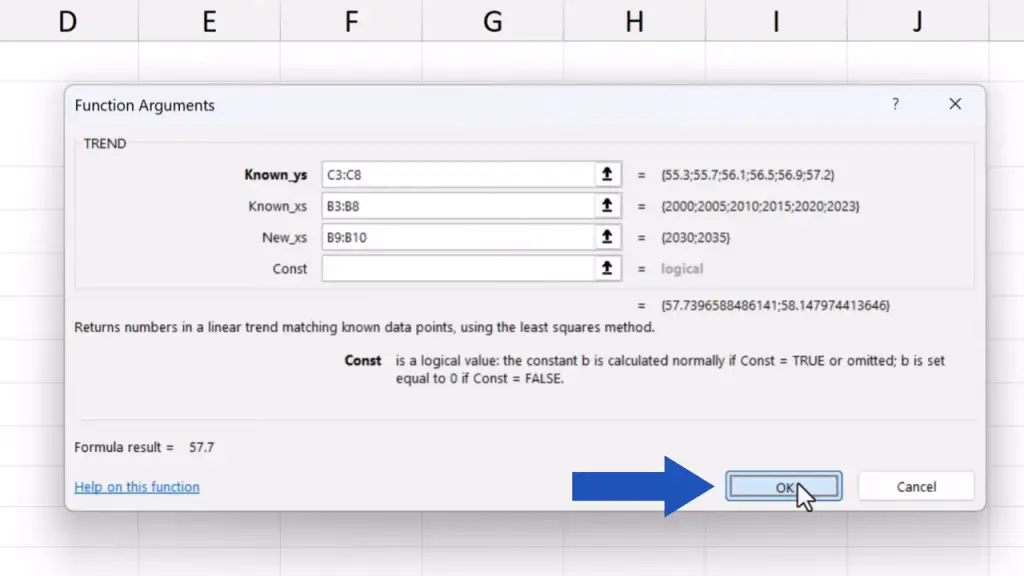
A window with several fields appears and we need to fill them in correctly.
The first field marked as ‘Known_ys’ are the values we already know and which appear on the y-axis.
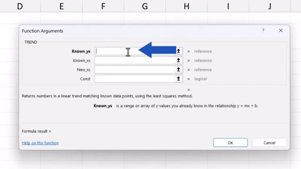
Here, they’re the temperatures for the past years.
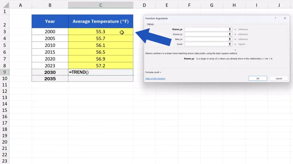
We enter the cells range C3 to C8, where these values are stored.
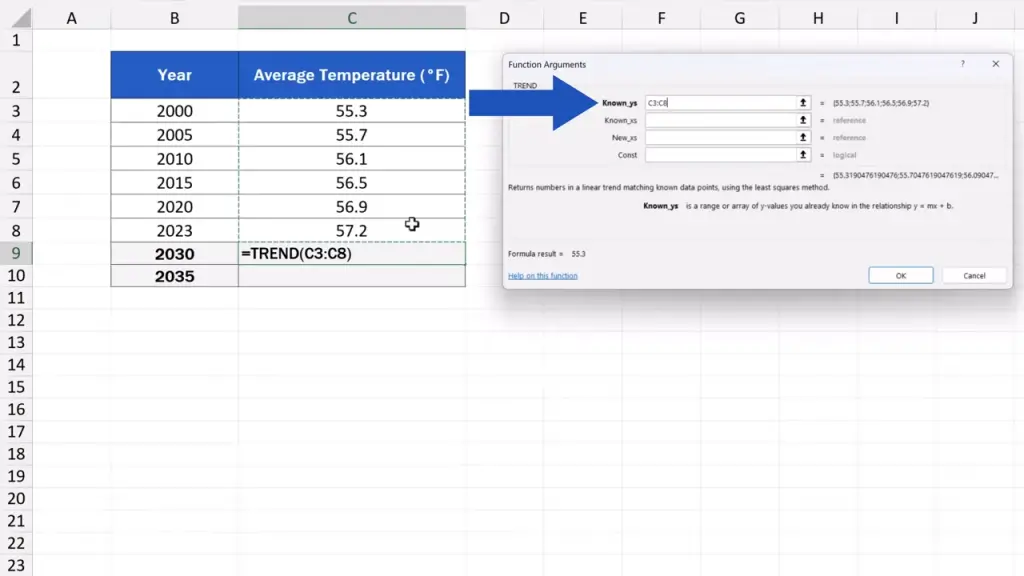
The next field asks for the ‘Known_xs’, the values from the x-axis.
These are the specific years. So, we’ll enter the range B3 to B8, with specific years linked to the temperatures.
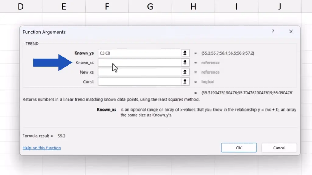
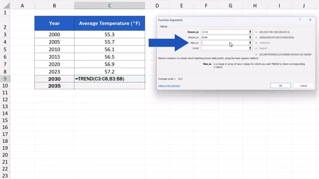
The next field says ‘New_xs’, which are the new values on the x-axis for which we expect Excel to calculate the forecast.
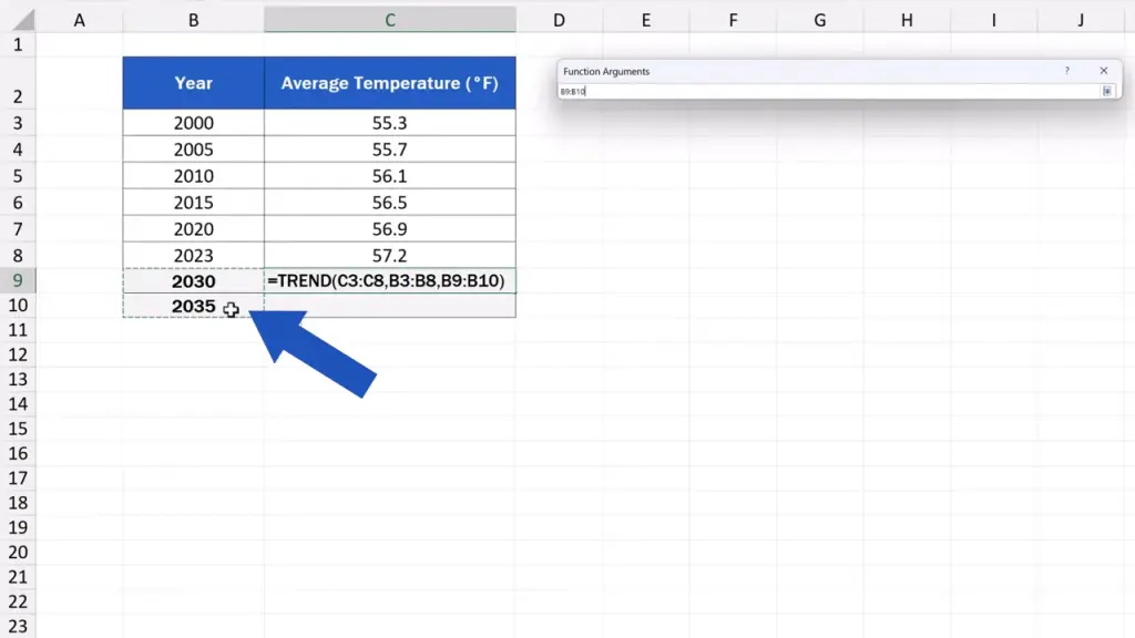
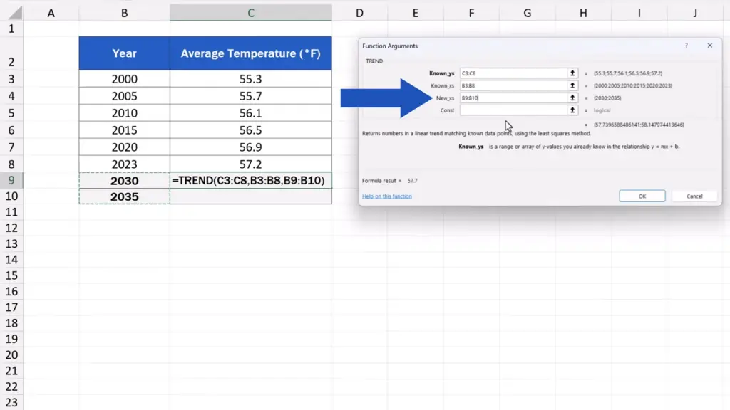
In our case, we select B9 and B10, where we’ve got the years 2030 and 2035 respectively. These are the years we want to calculate the forecast for.

The last field is marked as ‘Const’.
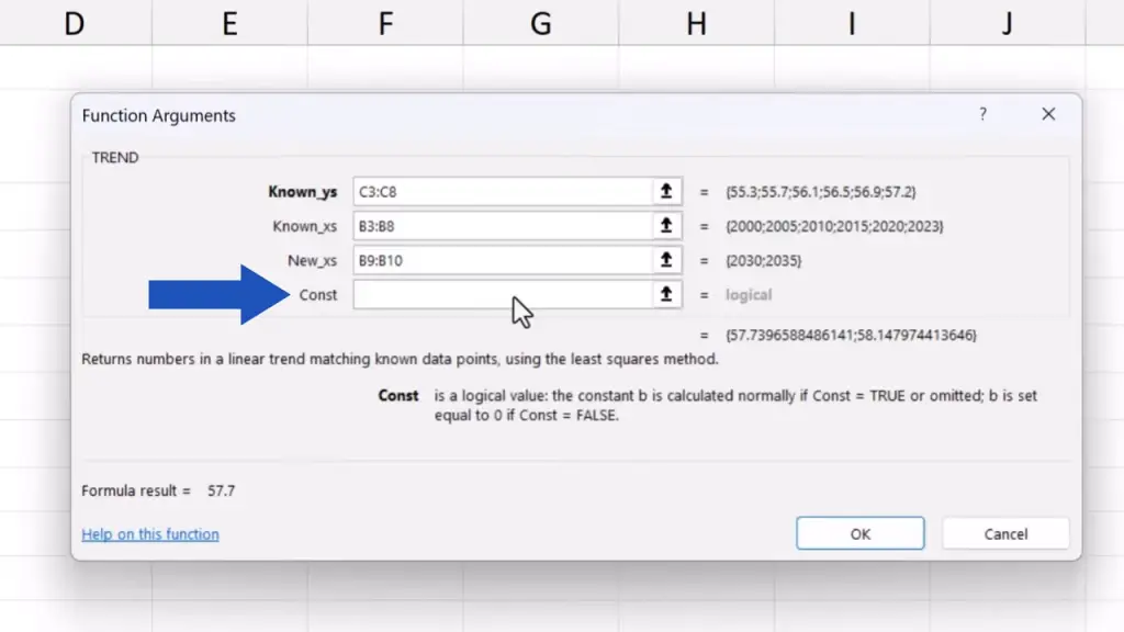
There are two options here to calculate the trendline in Excel.
If we enter ‘TRUE’ or leave the field empty, Excel will do the calculation that will best match the data provided. This option is used in 99% of calculations and it’s the most suitable option for revenue, population or temperature forecasting.
If we enter ‘FALSE’, Excel will lead the trendline through the origin, the point with the coordinates 0, 0. This is a special setting used mostly in more complicated calculations, like those done in physics or technical models.
So, if you’re not sure about what to go for, leave the field empty.
Just like we do now. The last field is empty and we can move on.
Now, we simply click on OK and Excel calculates the expected temperatures for the future years we’ve entered.
So, in 2030 the expected average annual temperature is 57.7 °F, and in 2035, it should rise to 58.1 °F.
This way we can use the TREND function to calculate a forecast we need with any data. And to make your data visualised in a neat way, make sure to check out the video tutorials from the series ‘How to Visualize Data in Excel’. Learn data visualisation in Excel, so you can present your data in an attractive manner.
Don’t miss out a great opportunity to learn:
If you found this tutorial helpful, give us a like and watch other tutorials by EasyClick Academy. Learn how to use Excel in a quick and easy way!
Is this your first time on EasyClick? We’ll be more than happy to welcome you in our online community. Hit that Subscribe button and join the EasyClickers!
Thanks for watching and I’ll see you in the next tutorial!

 How to Subtract a Percentage in Excel
Welcome! Today we’re going to talk about the simplest way how to…