How to Add a Legend in an Excel Chart
In today’s tutorial, we’re going to talk about how to add a legend in an Excel chart. Including a legend in a chart makes it easy to understand and it’s a great way to explain the data clearly.
Ready to start?
Would you rather watch this tutorial? Click the play button below!
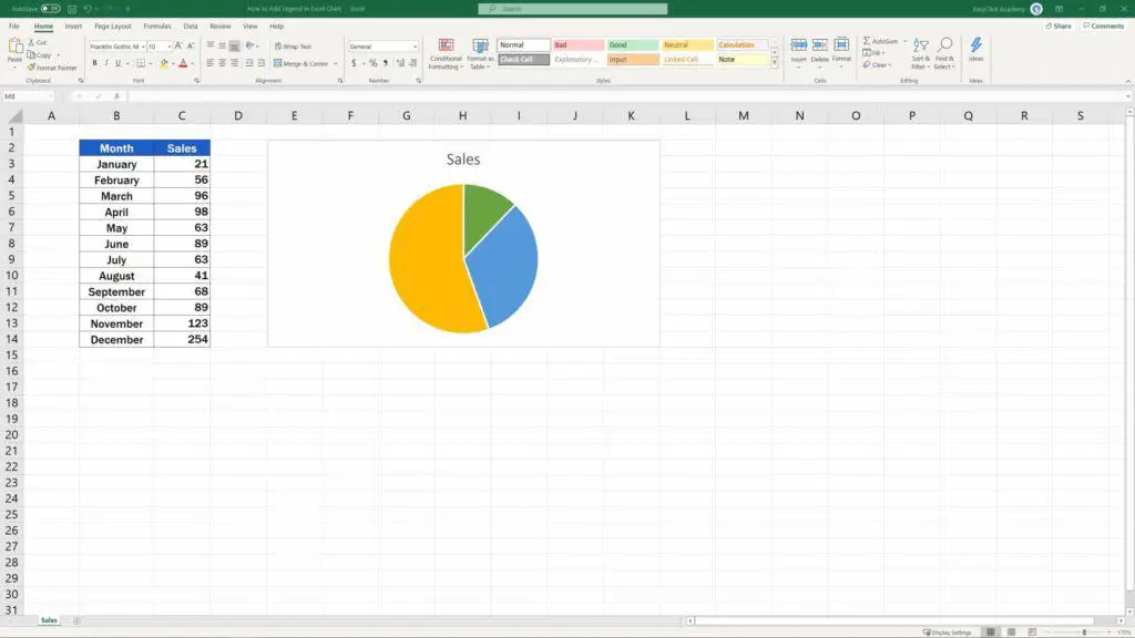
In previous tutorials, we had a look at how to create various types of charts and graphs. Now we’ll move a bit further and have a look at how to add a legend to this pie chart.
Let’s crack on!
How to Display the Legend for a Chart
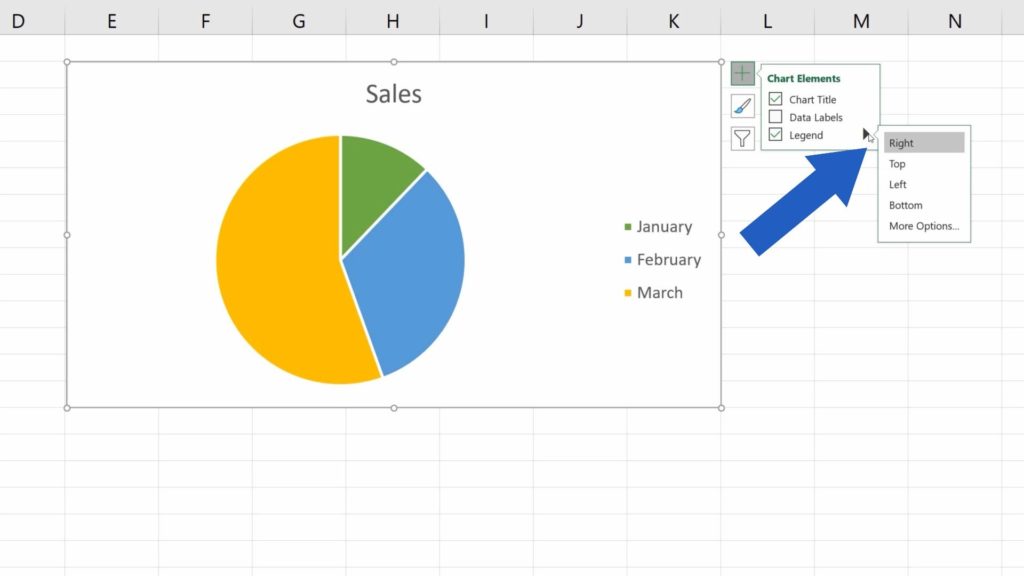
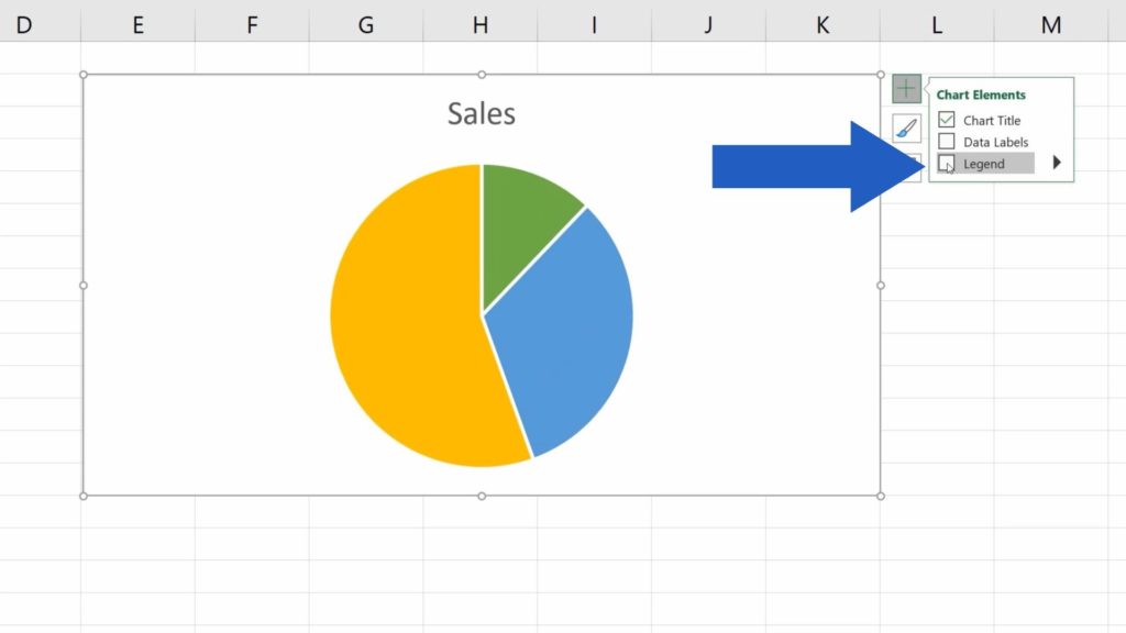
If you want to display the legend for a chart, first click anywhere within the chart area. Then click on the green plus sign which you can see on the outside of the top right corner of the chart area border.
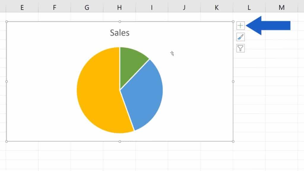
Here Excel offers a list of handy chart elements. Tick the option ‘Legend’ and Excel will display the legend right away.
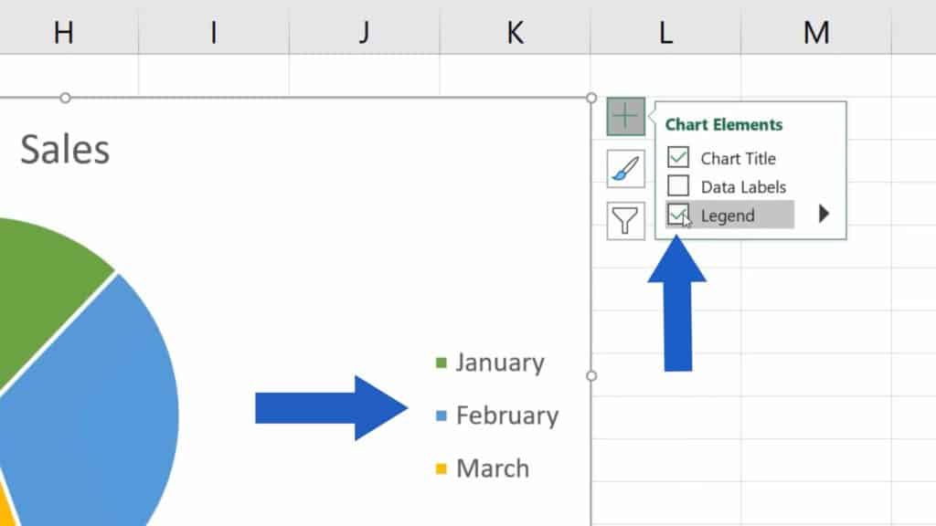
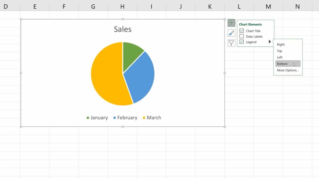
By clicking on this black arrow, you’ll also see the options where (within the chart area) you can place the legend. Choose the one which suits you best – whether it is on the right, at the top, on the left or at the bottom of the chart.
We’ll go for the option ‘Bottom’.
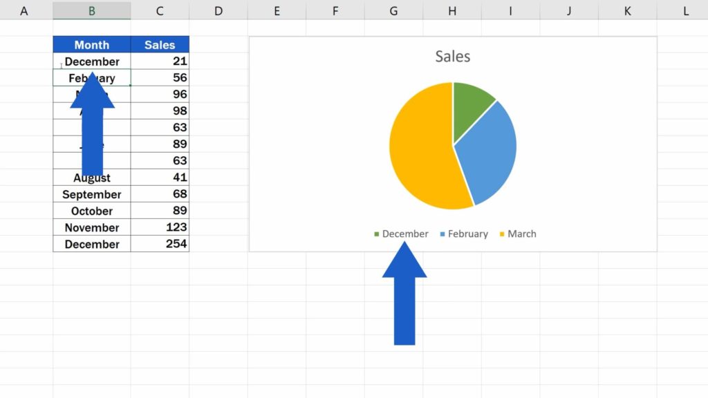
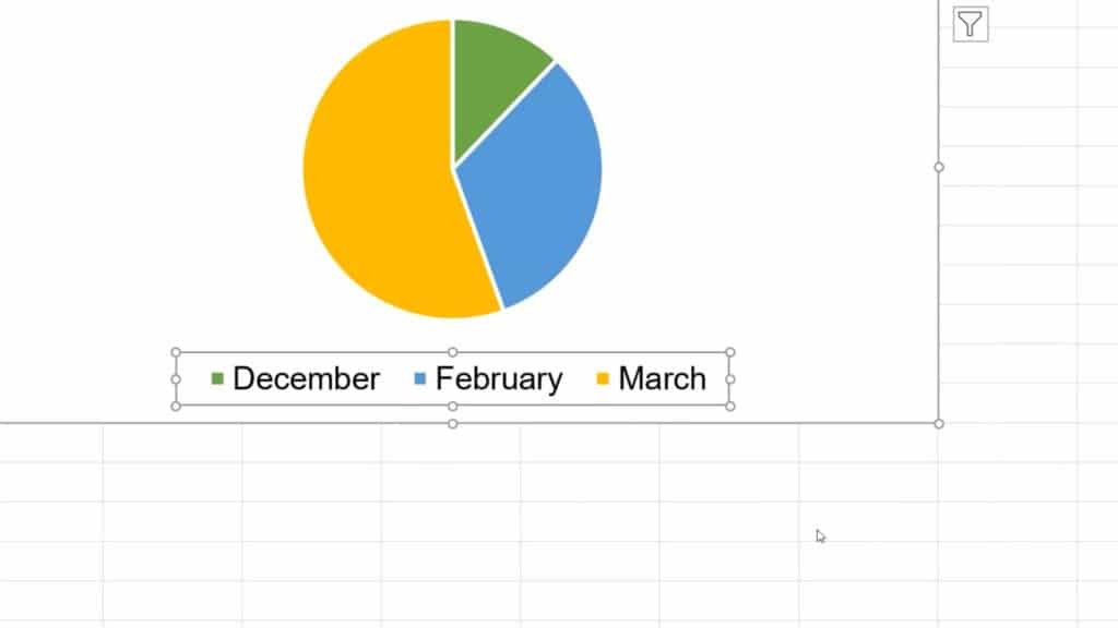
What’s good to know is that Excel takes the information you see in the legend directly from the data table that was used to create the chart.
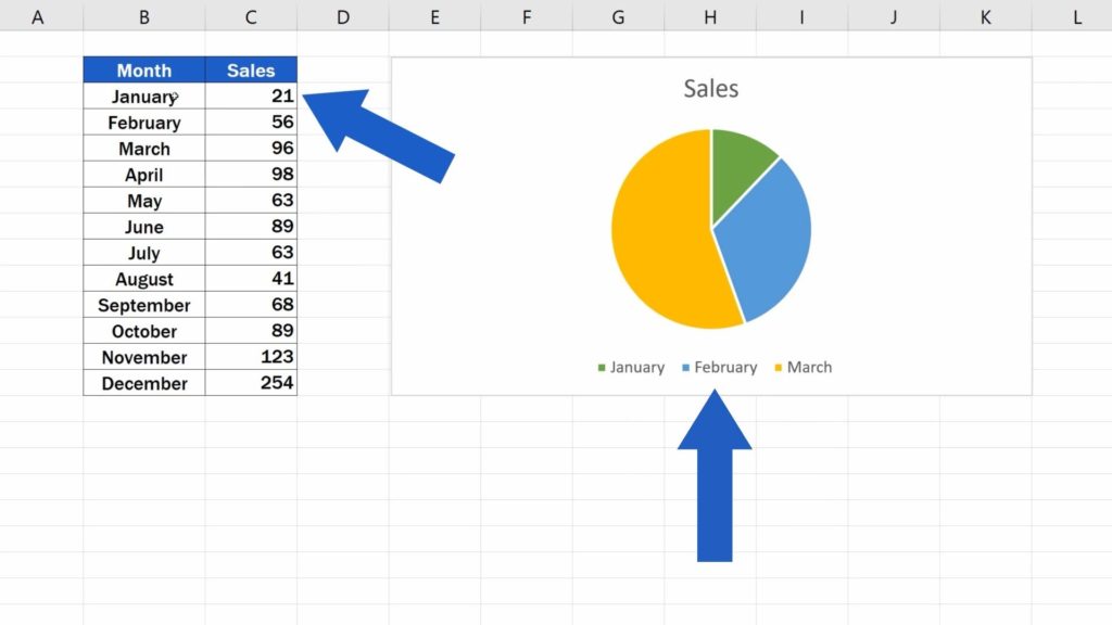
If we change any detail in the table, let’s say we replace ‘January’ with ‘December’, the legend will immediately reflect the change, which is great, because that means your chart will always be up to date!
And let’s have a look at a few more features!
How to Format the Legend
To format the legend, right-click on it and through this quick menu, you can change the fill and the outline of the legend.
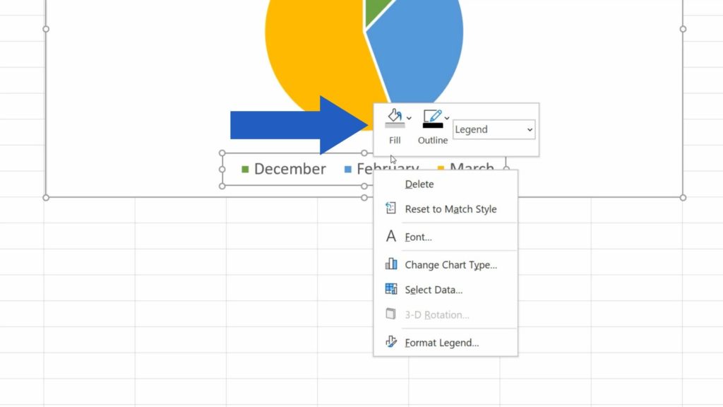
Through Font, you can choose a font size and style, pick a colour to your liking or even make use of various effects.
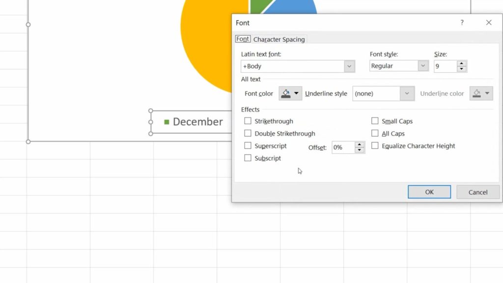
We’ll go for Arial, size 11, font colour set to automatic (which is black), we’ll click on OK and here we go! Just as we wanted.
How to Remove the Legend from the Chart
Finally, if you decide to remove the legend from the chart, click into the chart area again, then click on the green plus sign and simply unselect ‘Legend’.
And that’s all it takes!
If you’re interested to see how to add and format other chart elements, check out the links to more tutorials in the list below!
Don’t miss out a great opportunity to learn:
- How to Change Chart Style in Excel
- How to Add a Title to a Chart in Excel (In 3 Easy Clicks)
- How to Add Axis Titles in Excel
- How to Add a Trendline in Excel
- How to Make a Pie Chart in Excel
If you found this tutorial helpful, give us a like and watch other video tutorials by EasyClick Academy. Learn how to use Excel in a quick and easy way!
Is this your first time on EasyClick? We’ll be more than happy to welcome you in our online community. Hit that Subscribe button and join the EasyClickers!
Thanks for watching and I’ll see you in the next tutorial!

 How to Subtract a Percentage in Excel
Welcome! Today we’re going to talk about the simplest way how to…