How to Add an Average Line in an Excel Graph
In this tutorial, you’ll see a few quick and easy steps on how to add an average line in an Excel graph to visually represent the average value of the data.
Let’s start!
Would you rather watch this tutorial? Click the play button below!
How to Calculate Average
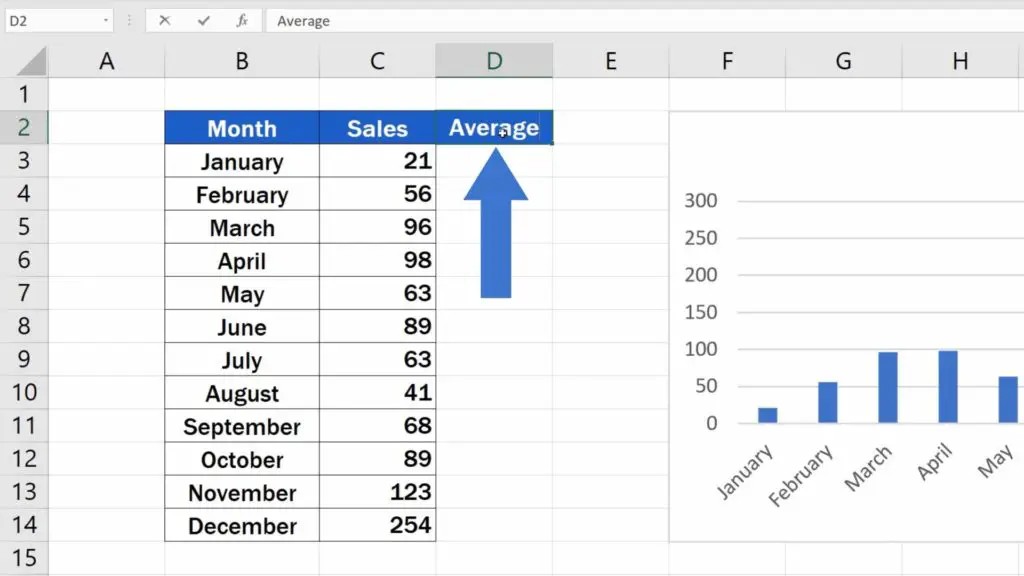
If we need to show the average value in a chart, we need to calculate it first. Let’s insert a new column right next to the column with sales and name it ‘Average’. We’re also going to adjust the formatting of the column to make it look like the rest of the table.
Great! Let’s carry on.
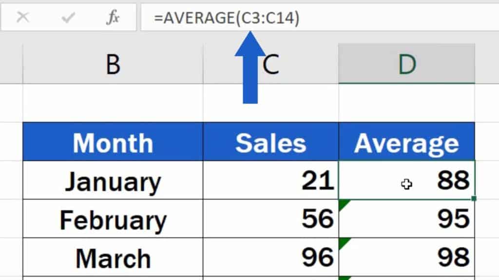
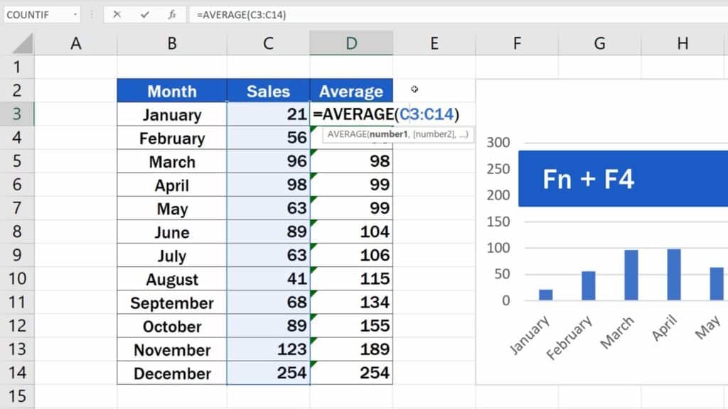
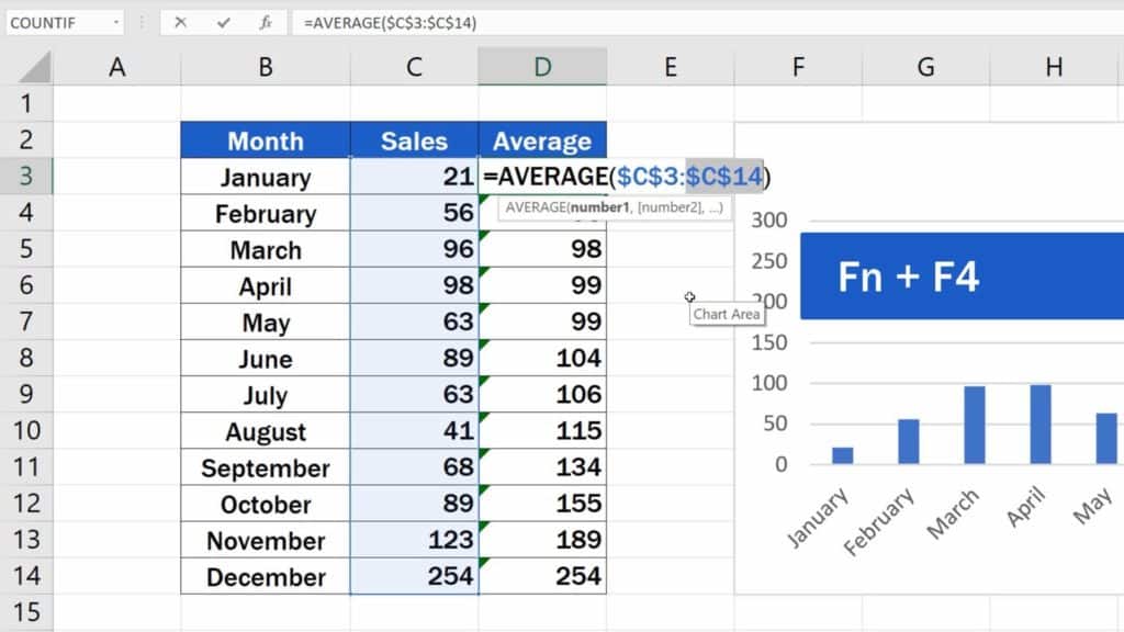
Click into the first row of the column Average and calculate the average value by entering the equal sign and typing in AVERAGE. Click on the suggested function and select all the data from which we’re going to calculate the average. Here the range will be all entries in the column Sales.
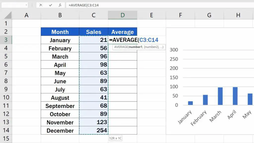
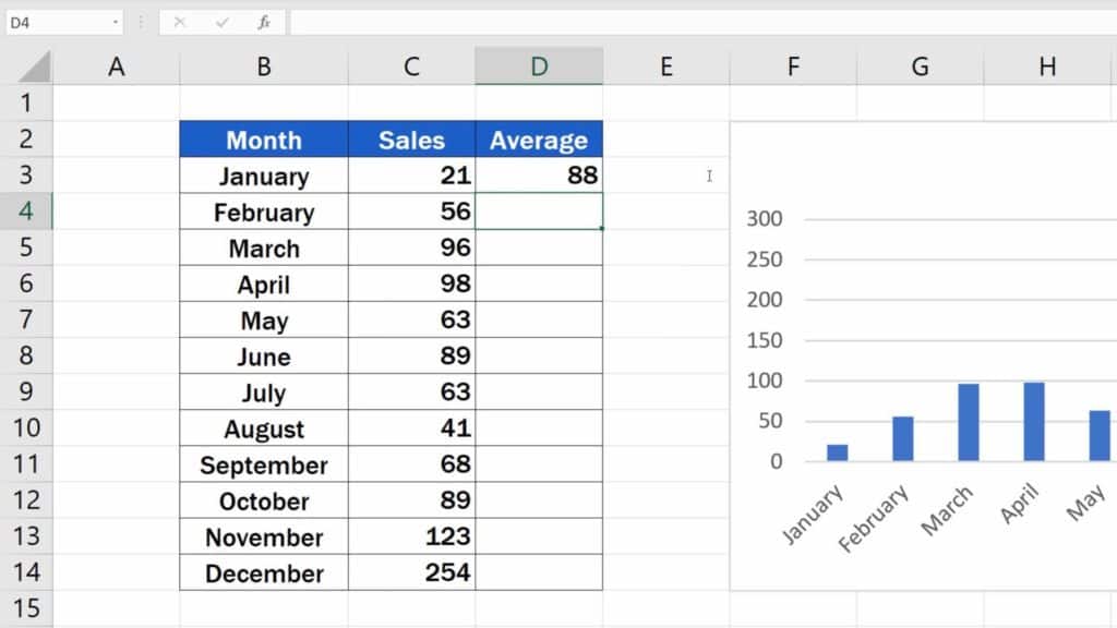
And we’ll close the brackets to see the result.
How to Copy the Function to other Rows
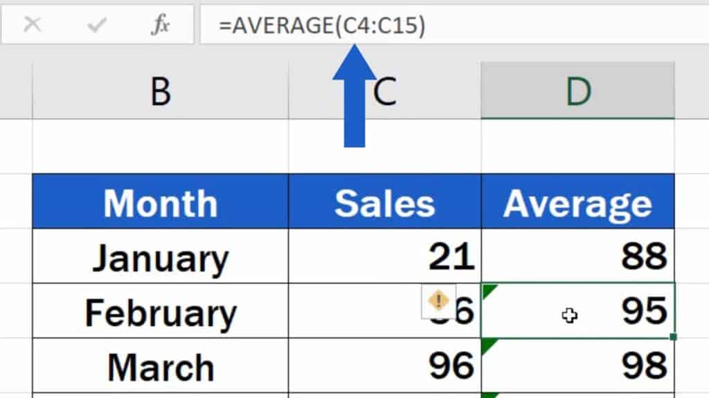
Now we need to copy the function to every row in this column, so that the average could appear as a line through every month in the chart. However, if we copy the function as it is, every month shows a different number, not the correct average value. This is because as we copied the formula, the cell references of the range moved with each row.

For example, here in row 3, we’ve got the specified cell range C3 to C14, but in row 4, the range shifted down by one, so we’ve got C4 to C15. This, of course, is something that needs to be fixed.
To ensure the function calculates the correct value in each row, we need to make sure that the formula refers to the same range in every instance. So, we need to anchor the references to the cells.
Let’s click into the cell D3 and ‘pin’ the reference to the first point of the range – C3. This can easily be done by clicking into the reference itself and then pressing the Function key and F4. Some of you might not need to press the Function key – this depends on what type of keyboard you’ve got on your computer.
A dollar sign appeared right next to the letter and the number, which means that this reference has been fixed and it won’t change as we copy the formula in the rows below. Every row will now refer to the cell C3. This is called an ‘absolute’ reference as opposed to the so-called ‘relative’ reference we had in our formula just a moment ago.
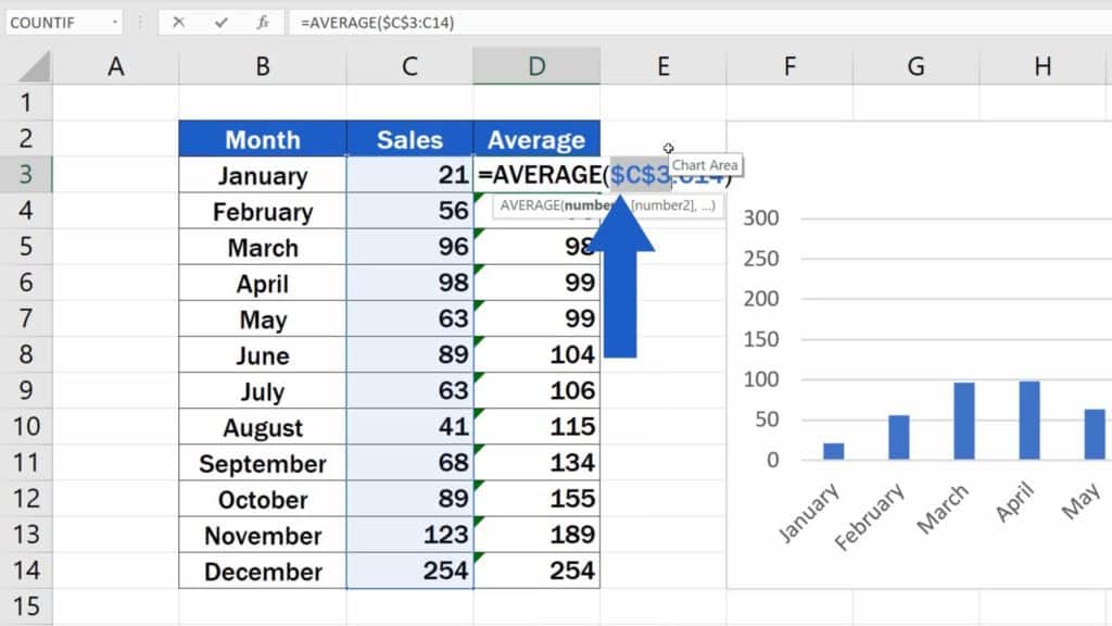
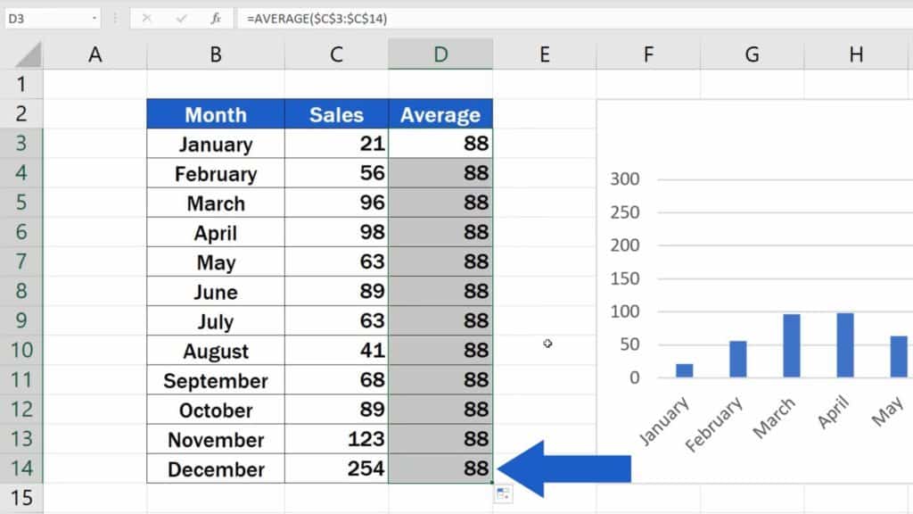
Let’s do the same thing with C14.
Now when the values have been fixed, we can press Enter and copy the function to the rest of the rows in the column. The result is now correct in each row, so we can carry on with adding the average line into our chart.
But, how to do that?
The Easiest Way How to Add an Average line in an Excel Graph
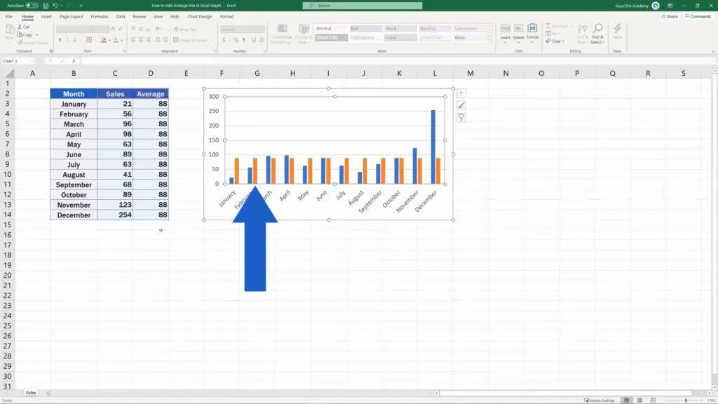
The easiest way to include the average value as a line into the chart is to click anywhere near the chart. The range of data already displayed in the chart has been highlighted in the table.
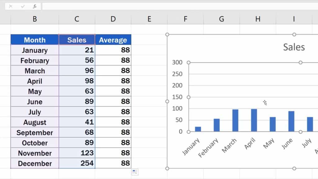
Click and drag the bottom right corner of the selection to expand it to the Average column.

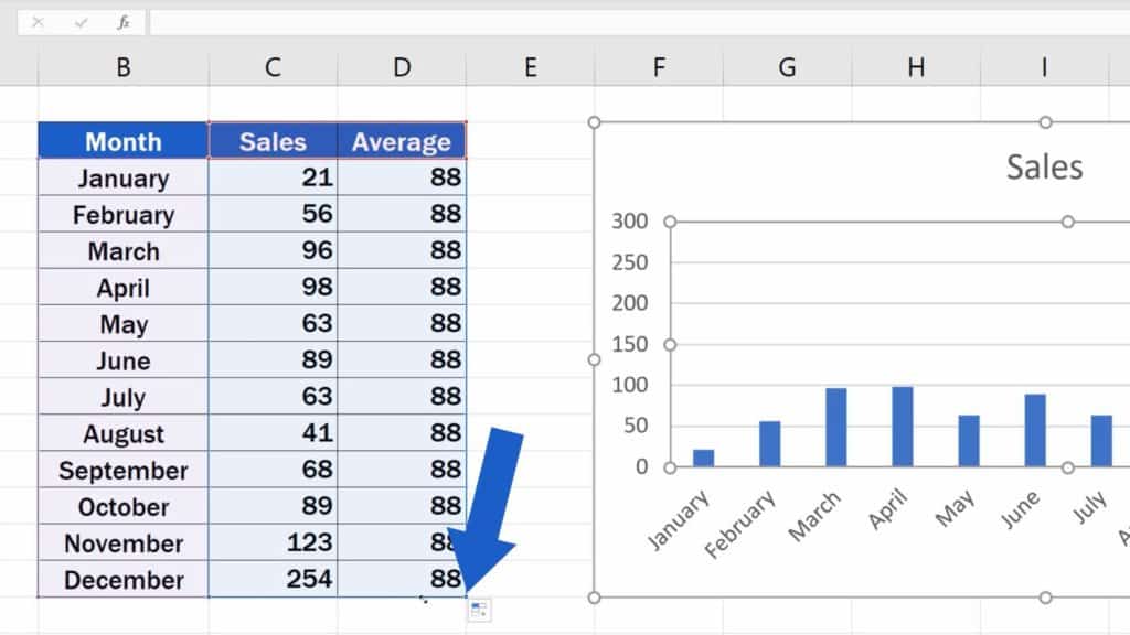
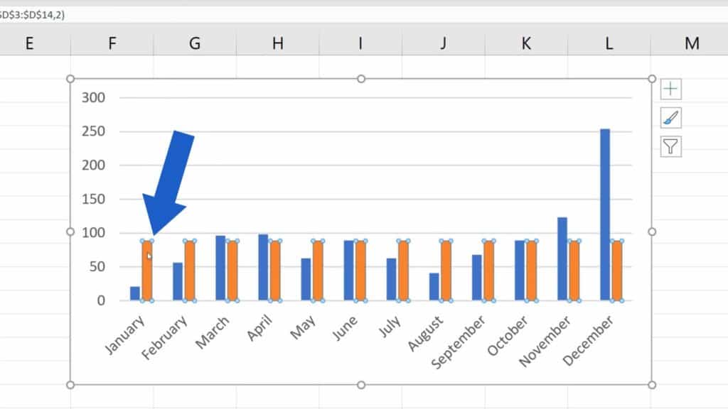
You can see that Excel included the new data from the Average column in the chart. It’s still not perfect, though. The average value now shows as a bar next to the bar for every month, but we want it to be displayed as a horizontal line running through the graph. So, let’s fix this together.
How to Change the Way the Average Data Is Displayed
To change the way the Average data is displayed, click on any value from Average in the chart. All values have now been marked with these little blue circles. This means we can format them.
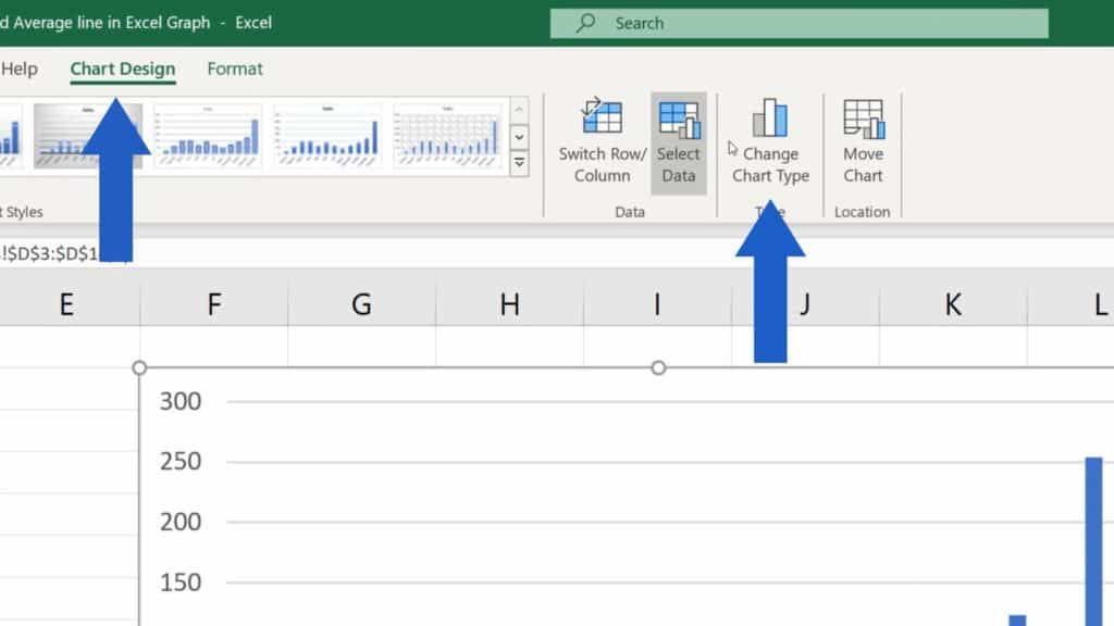
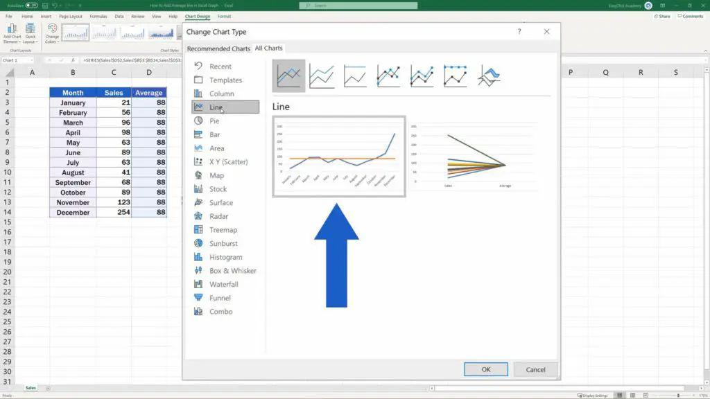
Let’s click on the tab Chart Design here at the top and choose the option ‘Change Chart Type’.
It seems pretty straightforward here – we want a line, so we’ll click on ‘Line’, but watch out!
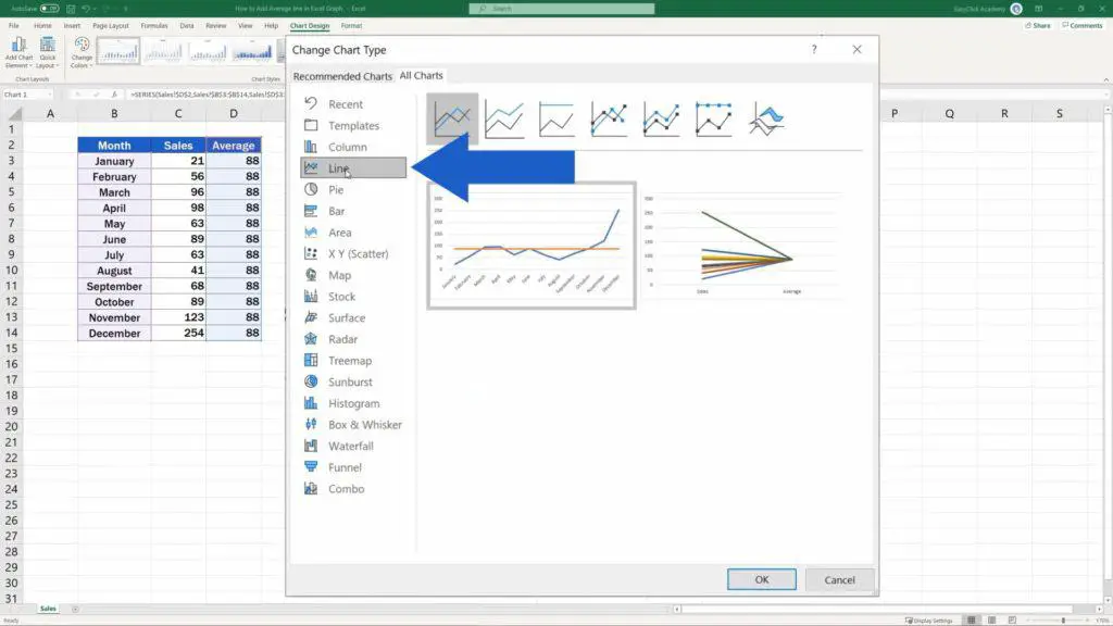
If we actually clicked on ‘Line’, Excel would turn into a line graph not only the average value, but also the Sales data, so both graphs would be line graphs, and we want the Sales data to appear as they were in the original chart.
That’s why we need to combine two types of graphs, so we’ll select the option ‘Combo’.
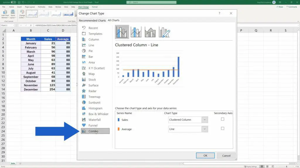
Thanks to this option, we can select only the data from Average to display as a line graph. The rest will stay as is, and Excel will show the average value as a line.
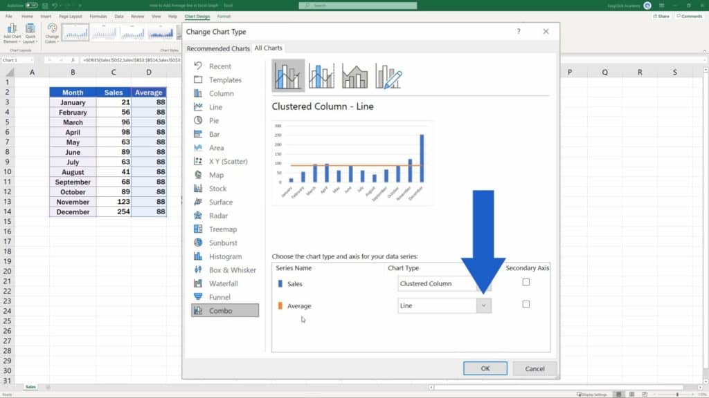
Confirm with OK and here we go!
Again, a huge benefit in adding an average line this way is that the whole graph is dynamic. If you change the November Sales value from 123 to 22, Excel will immediately recalculate the average value and update the display in the chart, too.
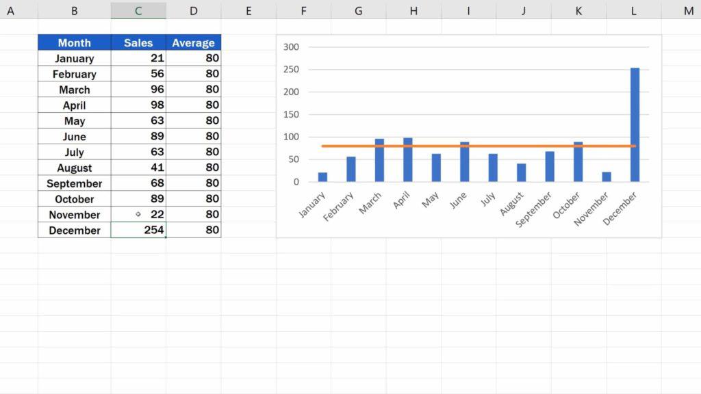
So, in case there’s a change in the input data, you don’t have to redo the whole thing again manually. Excel will do that for you in no time!
If you’d like to know more, for example how to add a trendline or how to work with more chart elements, watch separate tutorials by EasyClick Academy! Links to the tutorials are in the list below.
Don’t miss out a great opportunity to learn:
- How to Change Chart Style in Excel
- How to Add a Title to a Chart in Excel (In 3 Easy Clicks)
- How to Add Axis Titles in Excel
- How to Add a Trendline in Excel
- How to Make a Pie Chart in Excel
- How to Calculate an Average in Excel
If you found this tutorial helpful, give us a like and watch other video tutorials by EasyClick Academy. Learn how to use Excel in a quick and easy way!
Is this your first time on EasyClick? We’ll be more than happy to welcome you in our online community. Hit that Subscribe button and join the EasyClickers!
Thanks for watching and I’ll see you in the next tutorial!

 How to Subtract a Percentage in Excel
Welcome! Today we’re going to talk about the simplest way how to…