How to Change the Scale on an Excel Graph (Super Quick)
Today we’re gonna see a super quick way how to change the scale on an Excel graph to make your graphs easy to read.
Let’s get into it!
Would you rather watch this tutorial? Click the play button below!
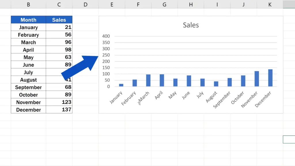
How to Adjust the Scale of a Graph
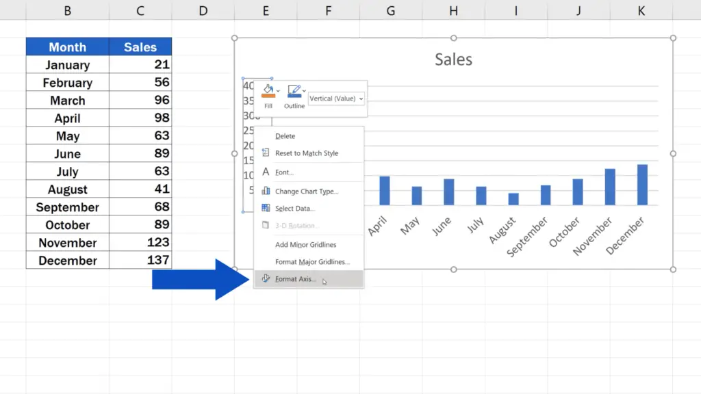
To adjust the scale of a graph, right-click on the vertical axis of the graph, just where you see the values.
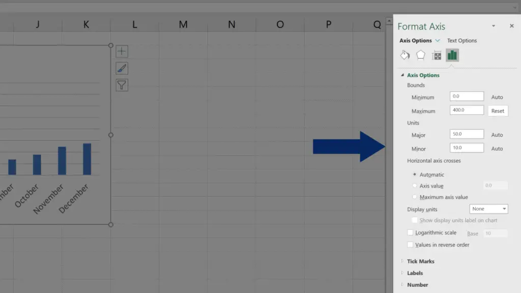
Select ‘Format Axis’, after which you’ll see a pane with additional options appear on the right. In ‘Axis Options’, we can set the graph bounds and units as needed.
But let’s go through it step by step.
How to Change the Scale of Vertical Axis in Excel
Currently, the bottom bound value is 0 and the upper bound value is 400.
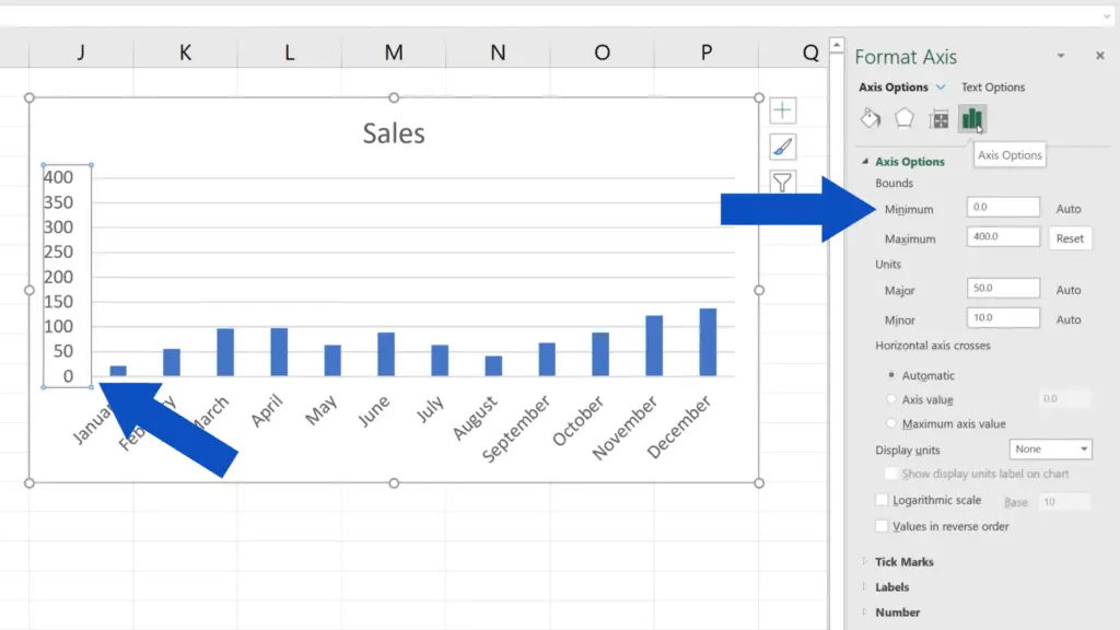

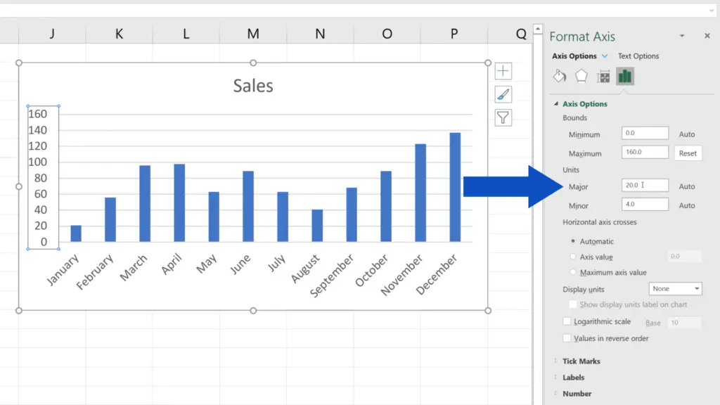
To improve the readability of the graph, let’s change the upper bound to 160. When we press Enter, Excel displays the changes in the graph, which makes the data clearer and easy on the eye.

At the same time, we can adjust the units displayed on the vertical axis. Now, the unit value is 20, which means that the difference between the numbers on this axis is 20.
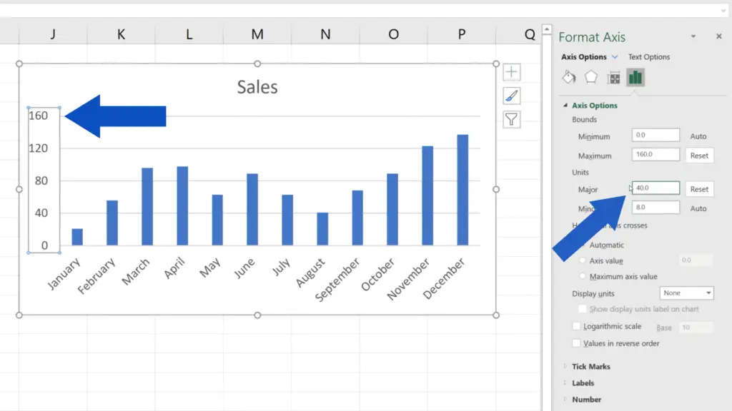
If we change the ‘Major’ units value from 20 to 40 and press Enter, the units on the vertical axis will change based on the adjusted settings.
This is a handy way to change scaling in a graph according to your needs.
If you’re interested in learning more, for example how to add or adjust other elements in a graph, have a look through more tutorials by EasyClick Academy. The links are included in the list below.
Don’t miss out a great opportunity to learn:
- How to Add Axis Titles in Excel
- How to Add a Trendline in Excel
- How to Add an Average Line in an Excel Graph
- How to Change Chart Colour in Excel
If you found this tutorial helpful, give us a like and watch other video tutorials by EasyClick Academy. Learn how to use Excel in a quick and easy way!
Is this your first time on EasyClick? We’ll be more than happy to welcome you in our online community. Hit that Subscribe button and join the EasyClickers!
Thanks for watching and I’ll see you in the next tutorial!

 How to Subtract a Percentage in Excel
Welcome! Today we’re going to talk about the simplest way how to…