How to Create a Heat Map in Excel (Quick and Easy)
In today’s tutorial we’re going to have a look at how to create a heat map in Excel, which comes quite handy when you’d like to provide a clear overview of data in terms of the highest, lowest, and middle values.
Ready?
How to Create a Heat Map in Excel
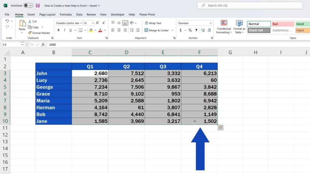
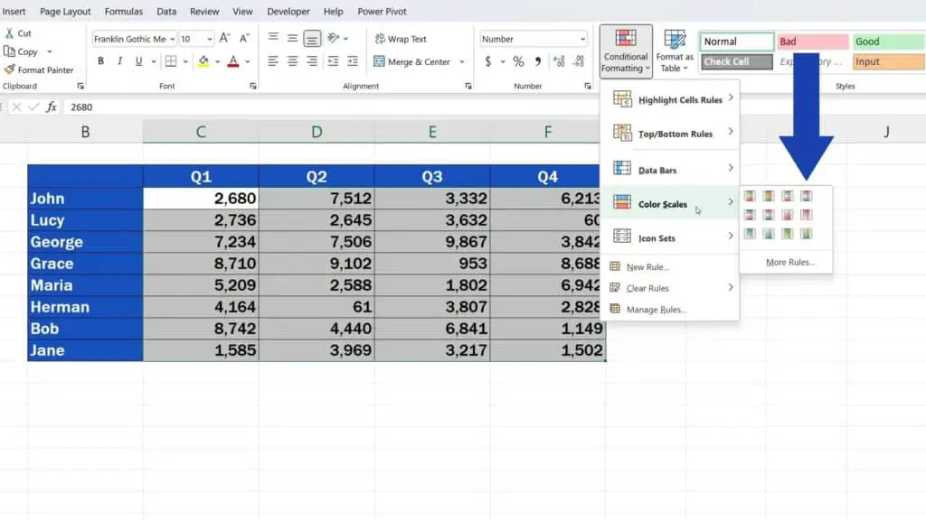
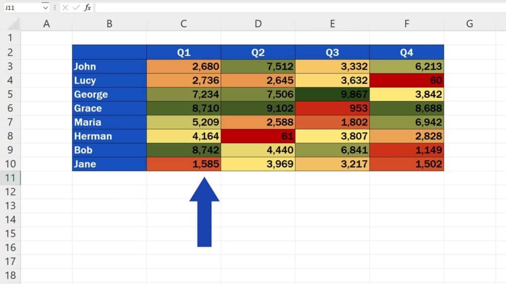
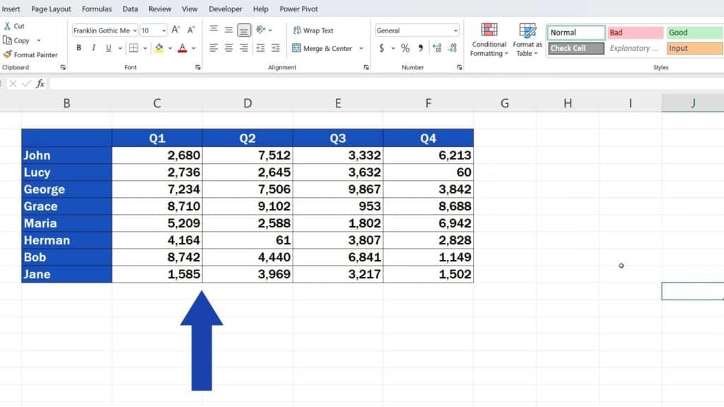
The first step towards creating a heat map is selecting all the data we’d like to include in the heat map.
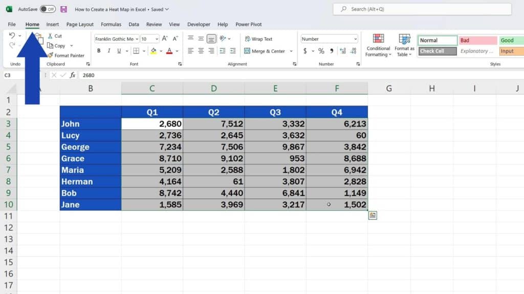
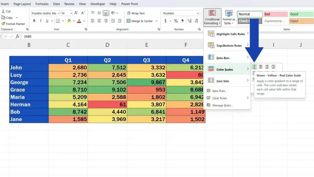
Then we go to the Home tab and in the section Styles we click on ‘Conditional Formatting’. Here we can find multiple useful options available for convenient data visualisation.
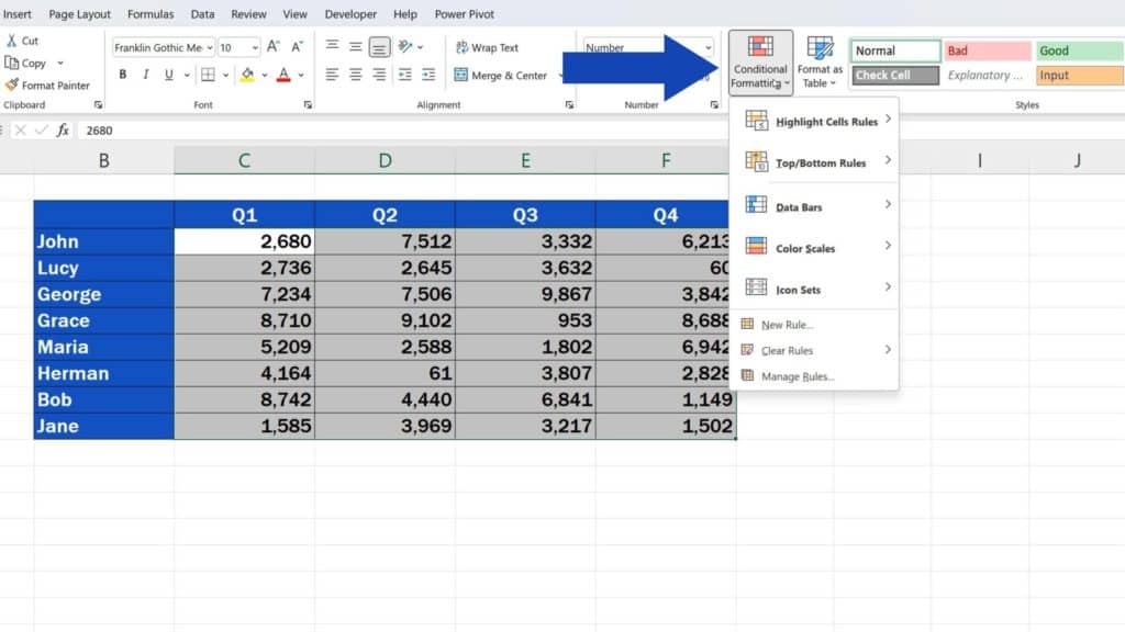
We go for ‘Color Scales’ and carry on choosing the most suitable visualisation out of pre-defined designs.
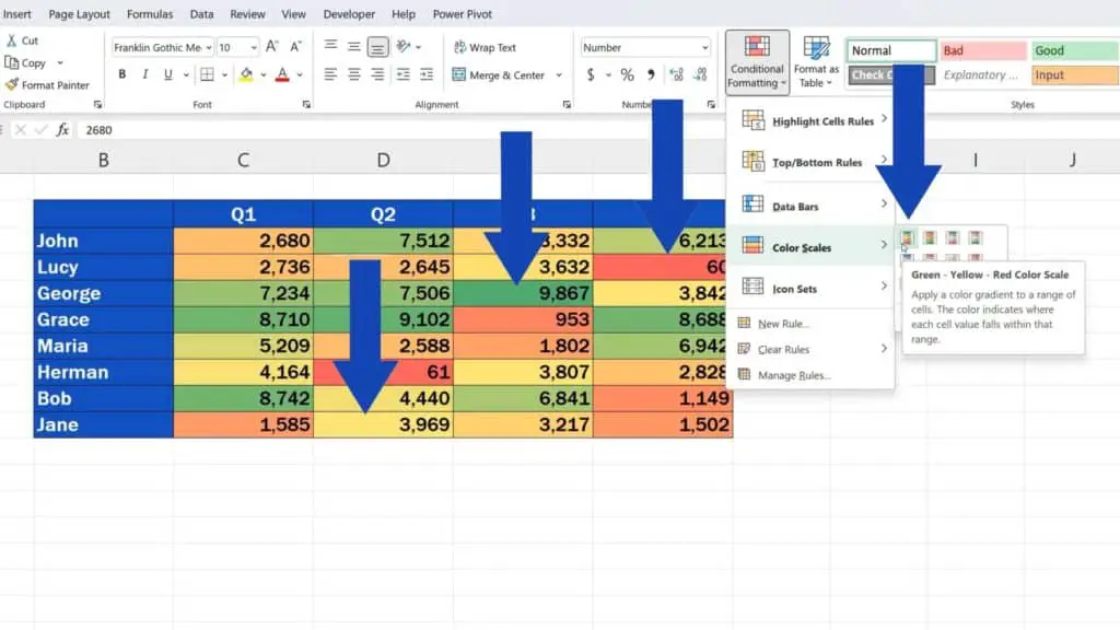
For example, the first design consists of three colours where green is for the highest, red for the lowest and yellow for the middle values.
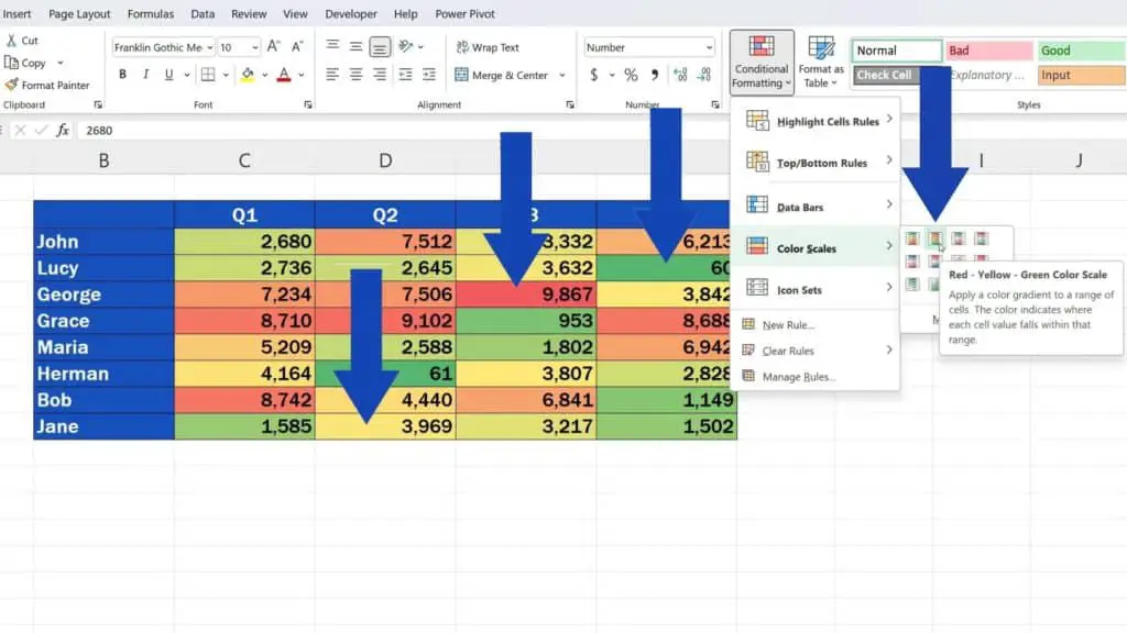
If we choose the following design, it’s vice versa – red for the highest, green for the lowest and yellow, again, for the middle values.
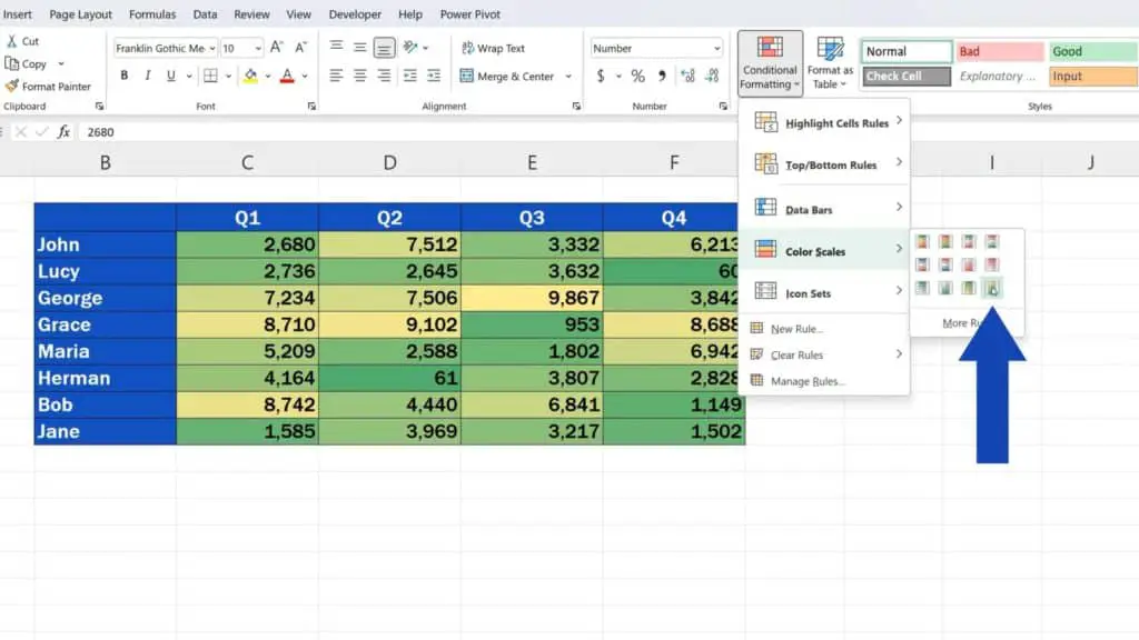
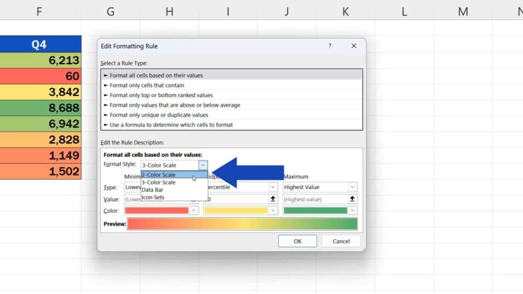
Alternatively, we can choose one of the two-colour designs.
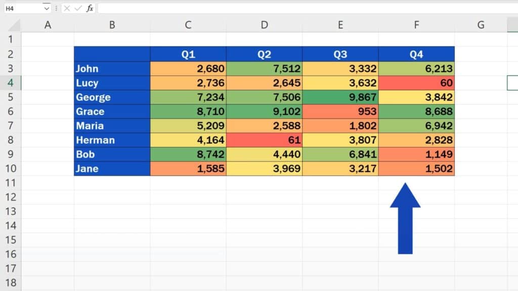
Here we’ll use the first style, so after clicking on it the heat map is on and the data appear much clearer when one looks at the table. One can spot right away the highest, lowest and middle sales values.
How to Edit a Heat Map in Excel
Let’s go on and have a look at how we can edit the heat map or, if needed, how to remove it, but let’s do this one by one.
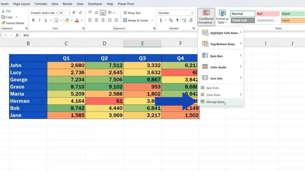
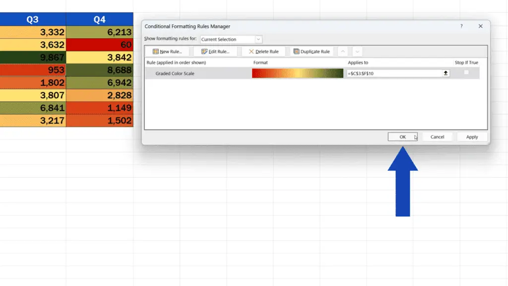
To edit the heat map, click anywhere within the area of the heat map, then click on ‘Conditional Formatting’ up here again and select ‘Manage Rules’.
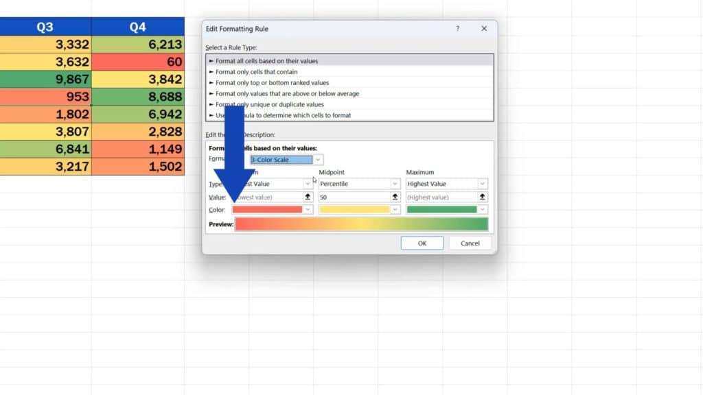
A window appears where you can click on ‘Edit Rule’.
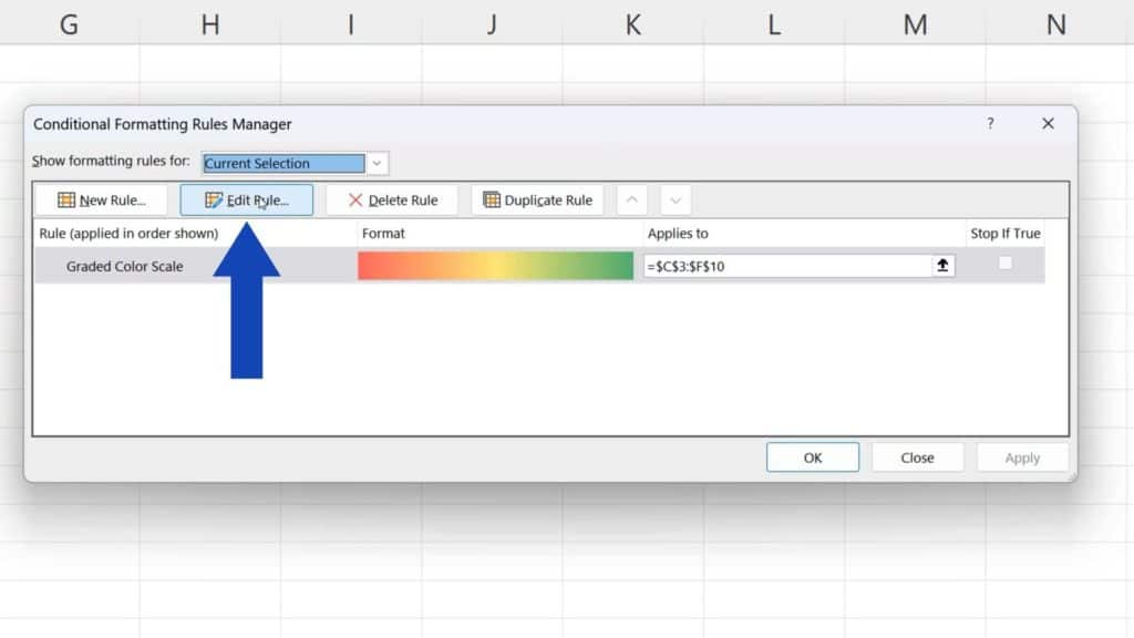
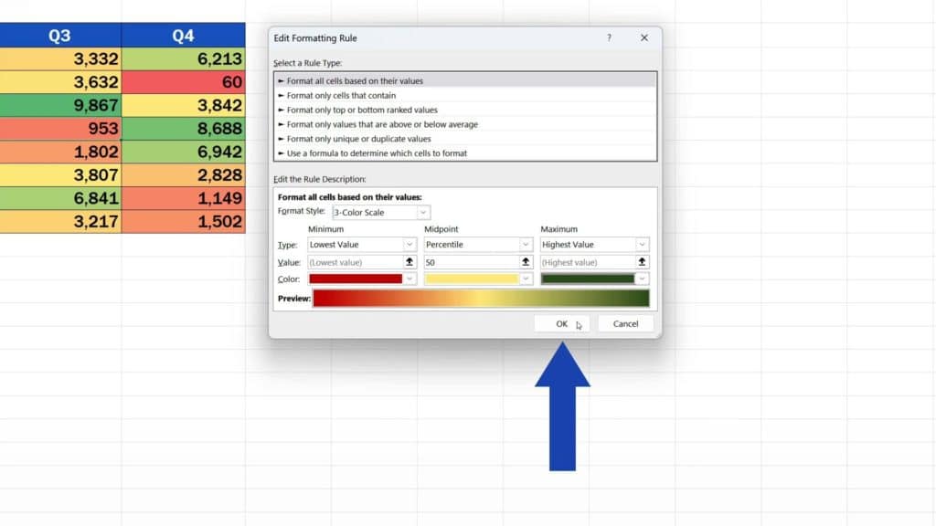
There are various options for editing, but we’ll go just through the basic ones. For instance, you can additionally decide whether you’ll use a three-colour or two-colour design. We’ll stick to the three-colour scheme and move on.
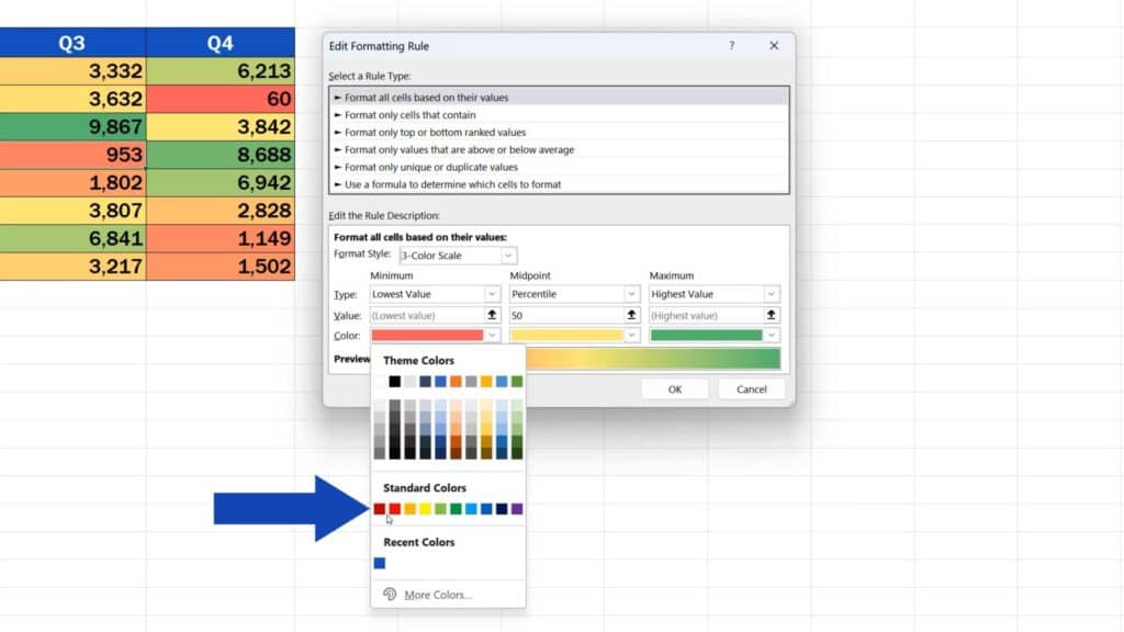
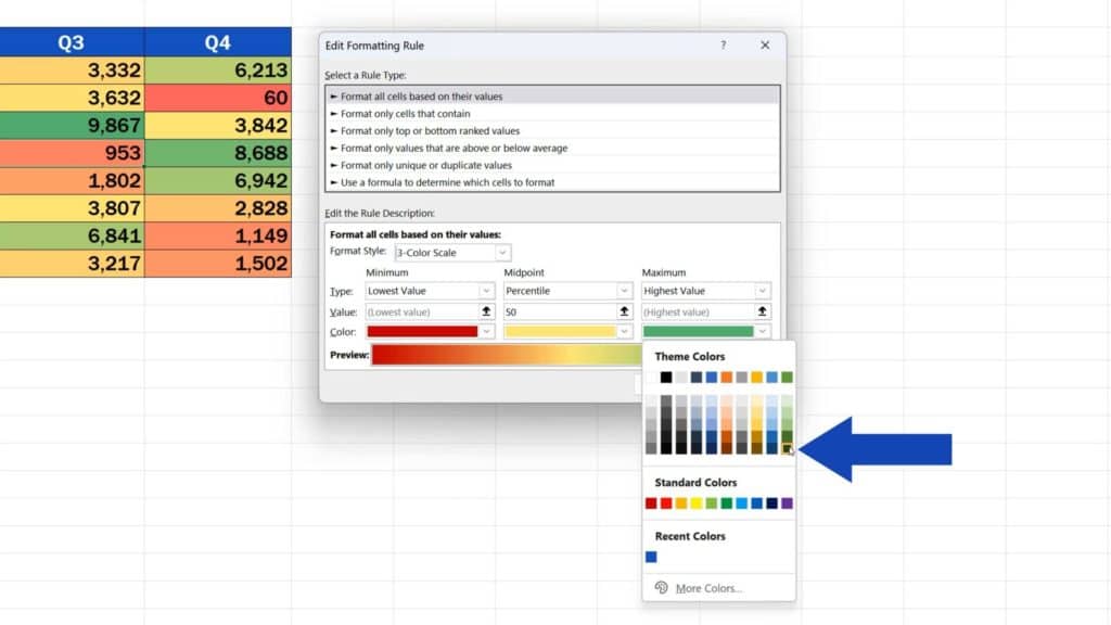
Here you can exchange the colours in the heat map for a completely different set, depending on what you need.
We’re going to use this deep red for minimum and this dark green for maximum.
We press OK, then we confirm by pressing OK again and here we go with the upgraded heat map!
How to Remove a Heat Map in Excel
To remove the heat map completely, select the option ‘Clear Rules’ in ‘Conditional Formatting’ and click on ‘Clear Rules from Entire Sheet’. And that’s it!
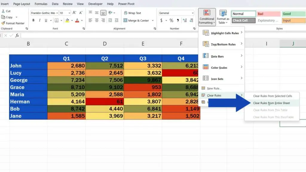
The heat map’s gone!
To have a look at other possibilities of data visualisation, check out more tutorials by EasyClick Academy! The links to the tutorials are in the list below.
Don’t miss out a great opportunity to learn:
- How to Use Color Scales in Excel (Conditional Formatting)
- How to Highlight Blank Cells in Excel (Conditional Formatting)
- How to Make a Scatter Plot in Excel
If you found this tutorial helpful, give us a like and watch other tutorials by EasyClick Academy. Learn how to use Excel in a quick and easy way!
Is this your first time on EasyClick? We’ll be more than happy to welcome you in our online community. Hit that Subscribe button and join the EasyClickers!
Thanks for watching and I’ll see you in the next tutorial!

 How to Subtract a Percentage in Excel
Welcome! Today we’re going to talk about the simplest way how to…